Clients
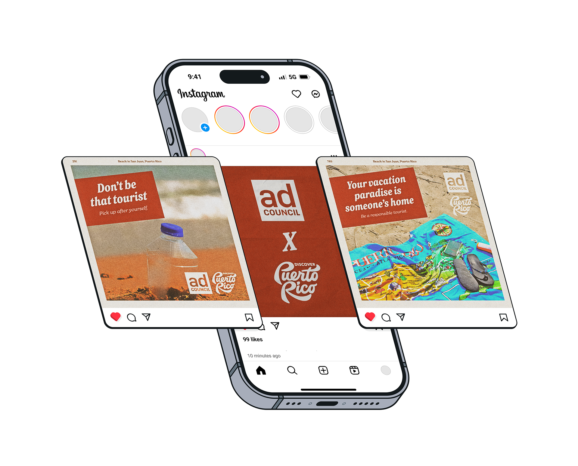
Ad Council, in collaboration with Discover Puerto Rico
Project Overview
Tasked to make a PSA campaign and a series of advertisements for it, I chose to focus on tourism. I decided to create this campaign about a topic I’m really passionate about: outsiders respecting my home, Puerto Rico.
Cases of tourists setting businesses on fire or causing general chaos in the island have gone up alarmingly. I wanted to spread awareness about the fact that what might be a vacation spot for some is someone else’s home. It’s easy to fall into the mindset that being on a trip is a greenlight for any behavior, but the locals have to deal with the consequences of tourists' wreckless actions. Through captivating editing and imagery that conveys the fact that tourism can negatively affect the island, I transmitted the message to be more mindful about the way one travels.
MY TAKE
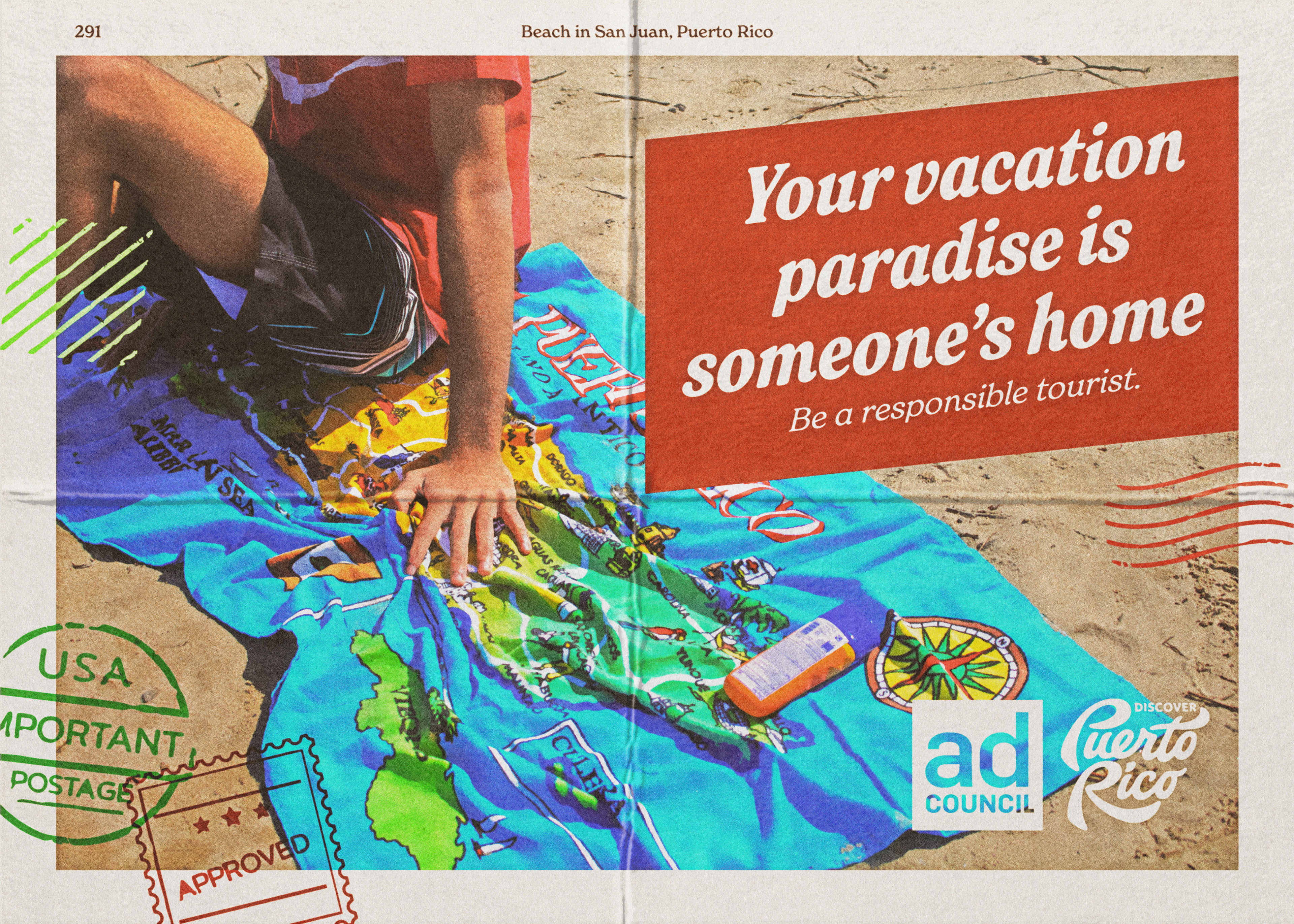
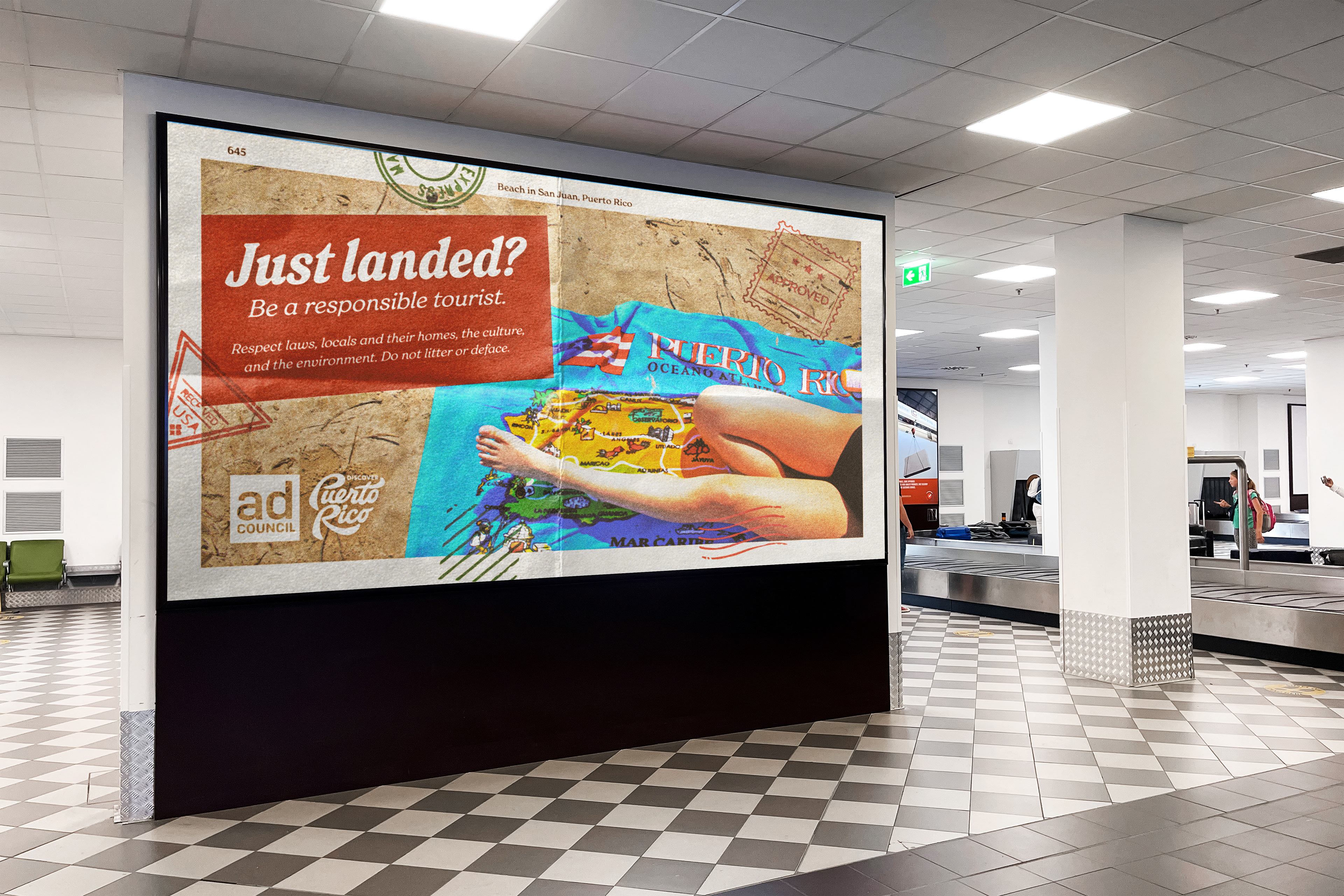
I based my design choices on targetting college students and young adults who vacation to Puerto Rico. It was important to emphasize the importance of respecting vacation destinations, which is why the campaign's main slogan is "Your vacation paradise is someone’s home." It is made very clear to the viewer that the CTA is to be a responsible tourist. This PSA is, by no means, meant to stop people from vacationing at the island. Its goal is to remind tourists to be more mindful about how they behave while they're there.
Designing for the Ad Council, the campaign is in partnership with the Puerto Rican Tourism organization Discover Puerto Rico. Although the company mainly focuses on internal tourism, it also reaches out to tourists traveling to the island. The institution even has articles related to responsible tourism and eco-tours, which made it a great fit for this collaboration.
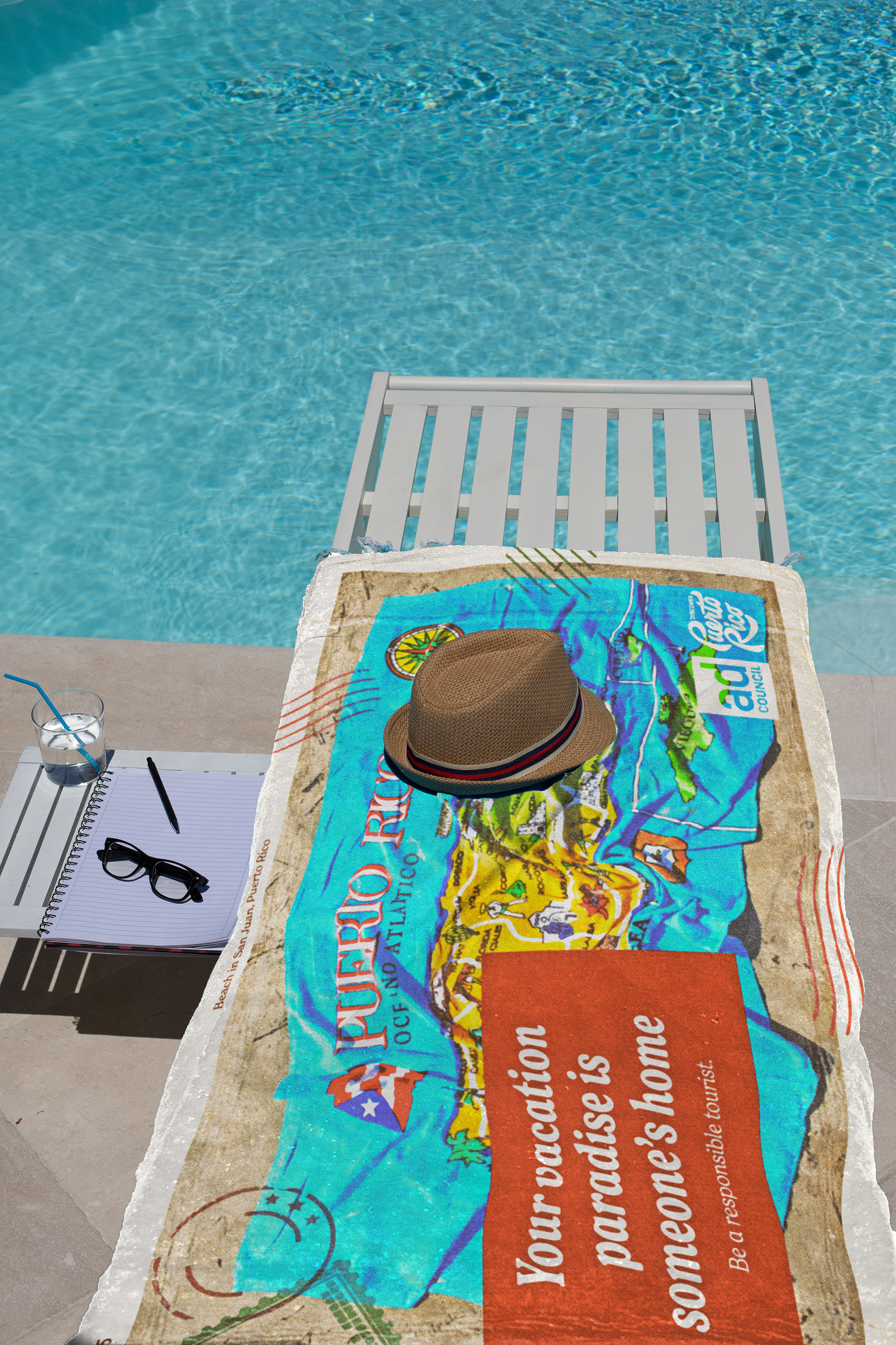
When deciding the aesthetic for the campaign, I found that the look of 80s photography and postcards would be eye-catching and appealing for a generation that did not grow up with it. Almost as a counter to modernism and minimalism, younger people have discovered an appreciation for vintage-looking photography. Using that effect also helps the message come across as softer, making people more likely to be receptive to it.
To get that old-picture feel, I added plenty of grain grain, limited the darkness of shadows, and blew up highlights. I also added the texture of folded paper on top. This resulted in images that are interesting to look at and remind its audience of 80s vacation catalogs.
MOODBOARD
Images retrieved from pinterest.com.
I was inspired by a combination of magazine advertisements from the 80s, or replicating the look from that decade, and vintage postcards. Looking at them, I can only think of summer and the sun, which my images needed (this statement will make sense once you see the original pictures).
I noticed that most of these ads used a serif typeface, had some type of border framing the photography, and the contrast was kept at a medium level, which I adapted into my ad.
SKETCHES
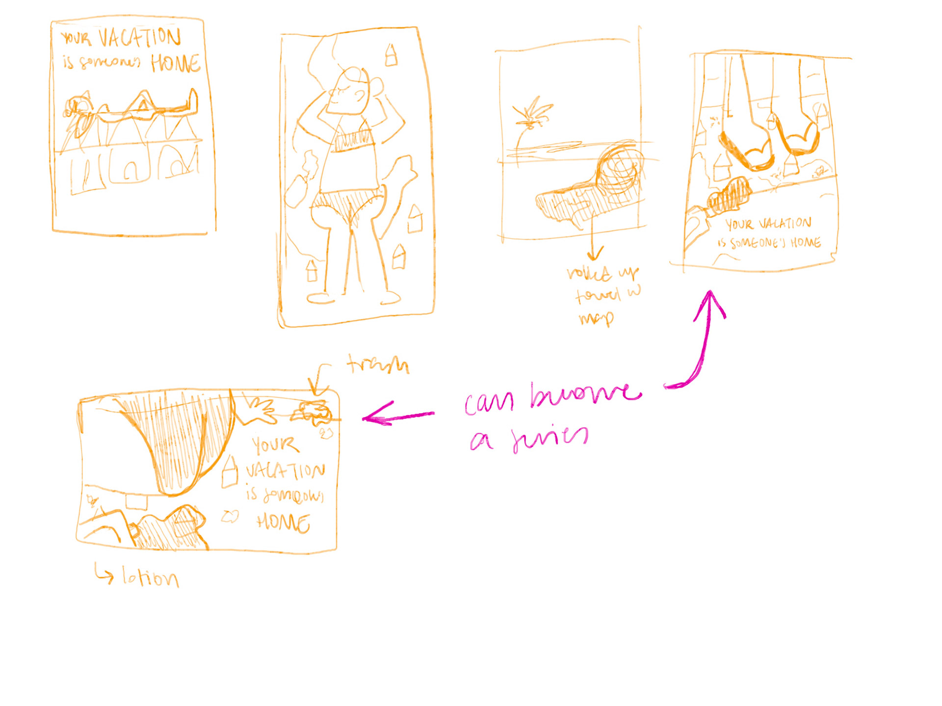
The image on the right is a quick mock-up of what I wanted to recreate.
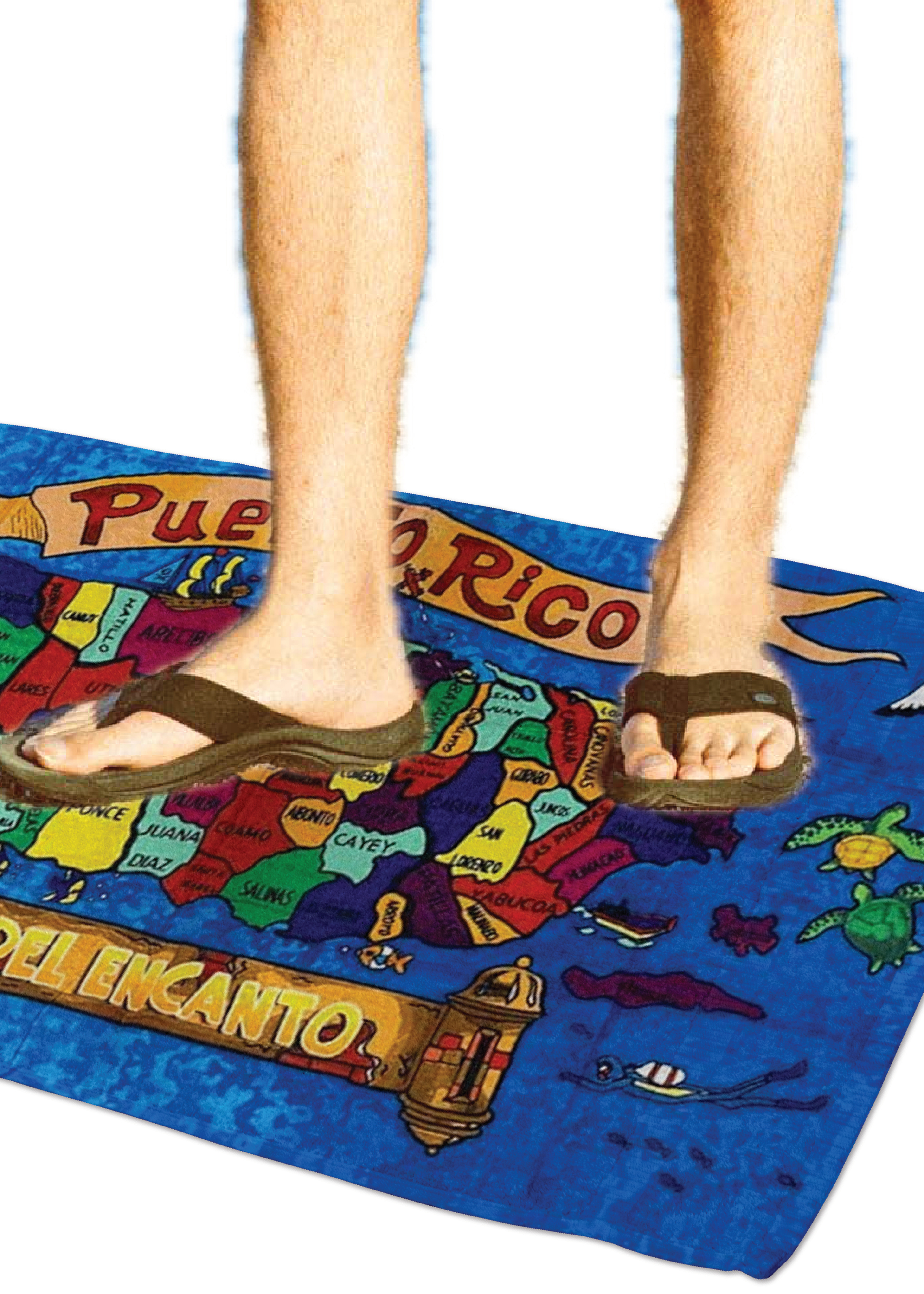
The idea for this campaign emerged from one of those rare occasions where the skies open and the concept immediately comes to you. After only three sketches, I landed on an idea that I could serialize. I have vivid memories of going to gift shops in a couple different islands, including Puerto Rico, and seeing map souvenir towels. I thought that using a towel and getting "tourists" to stand on it would send a very clear message of how tourism directly affects the island. Once the idea was solidified, the next step was to carry out a photoshoot.
PHOTOSHOOT
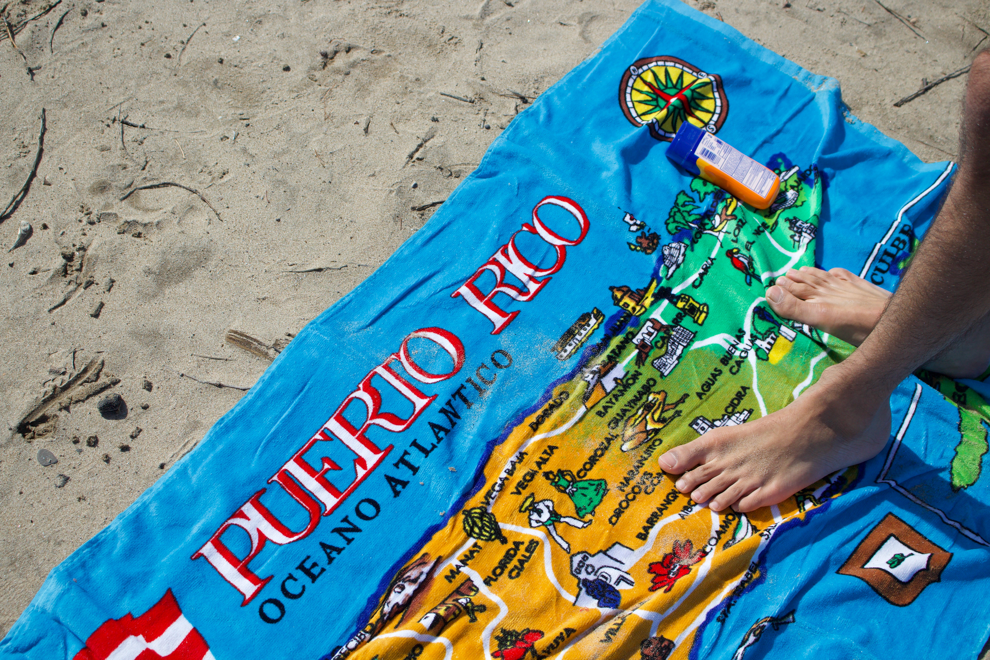

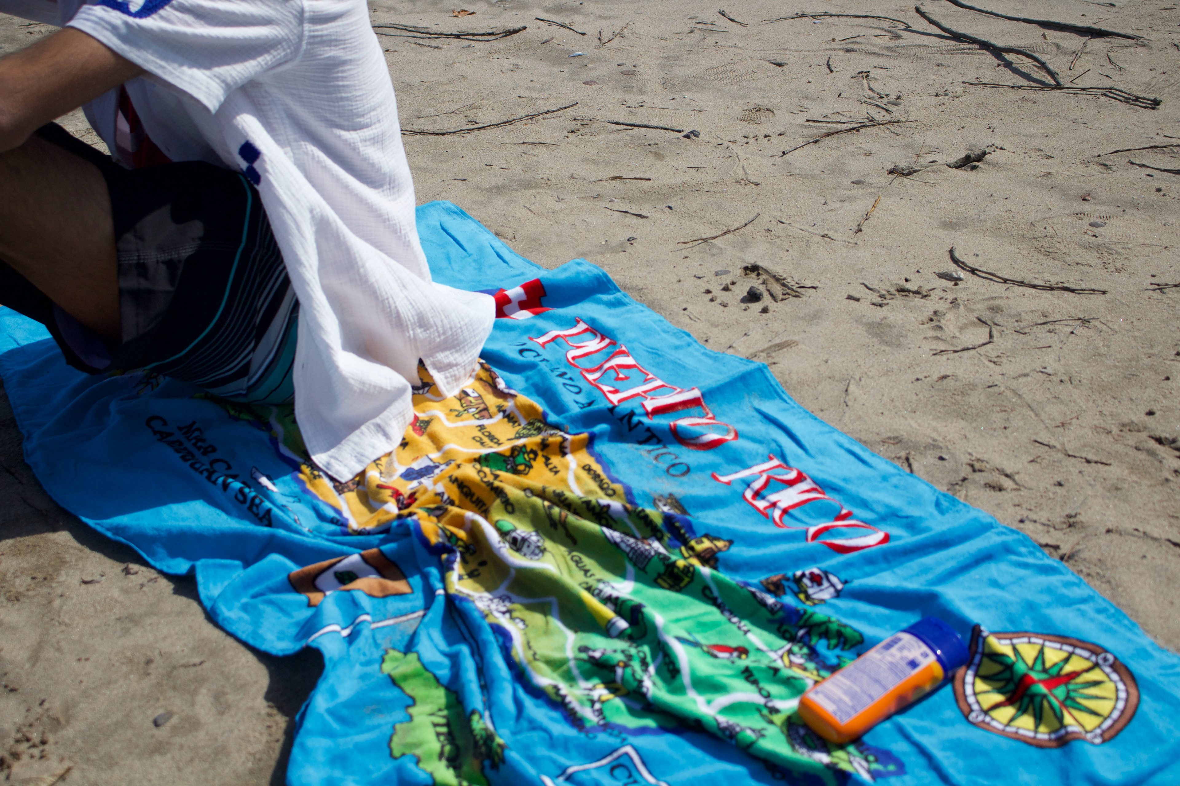
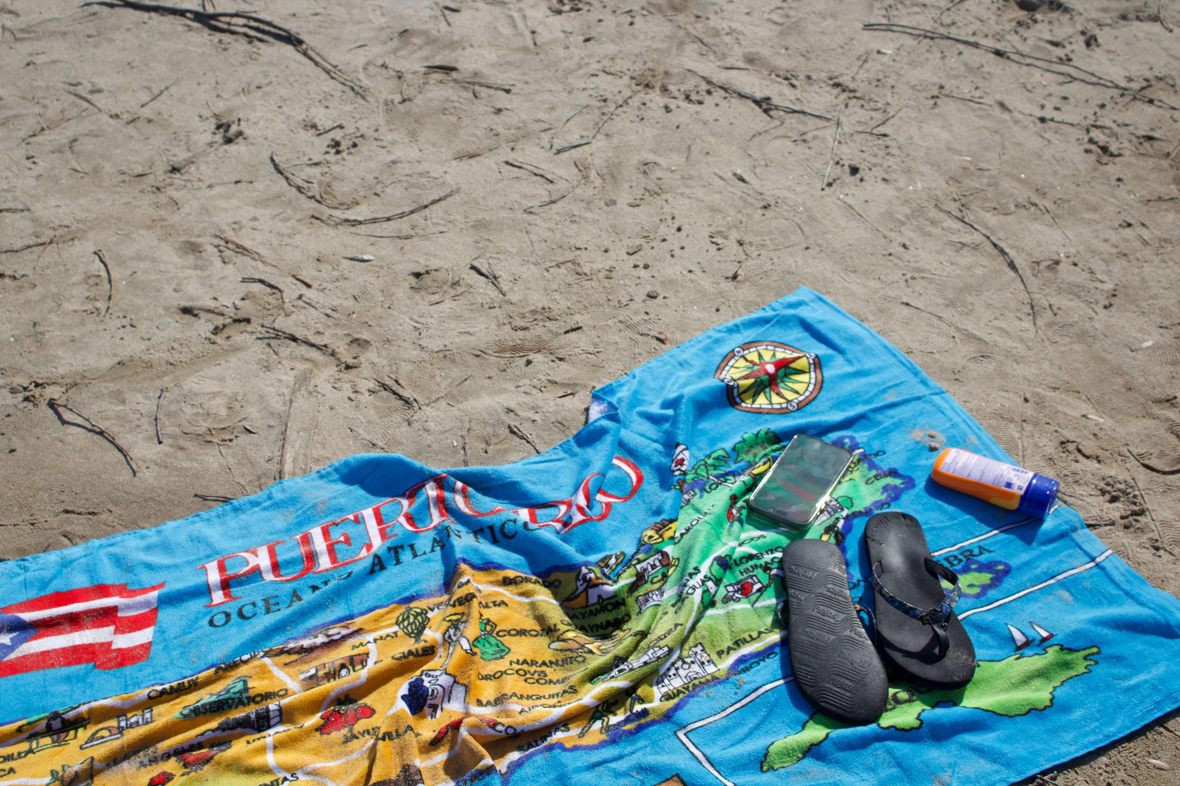
These are the raw pictures, well before any editing.
For this project, it was essential to take the pictures myself. After acquiring the souvenir towel with a map of Puerto Rico and enlisting a friend crazy enough to brave 30ºF weather next to snow in a bathing suit, we started the photoshoot.
Most pictures didn't make the final cut, as I only chose and edited the most impactful ones. It was quite the task to take these dark Rochester weather pictures and make them look like they were taken in a tropical island, but I achieved it, and I could not be any happier with how they turned out.