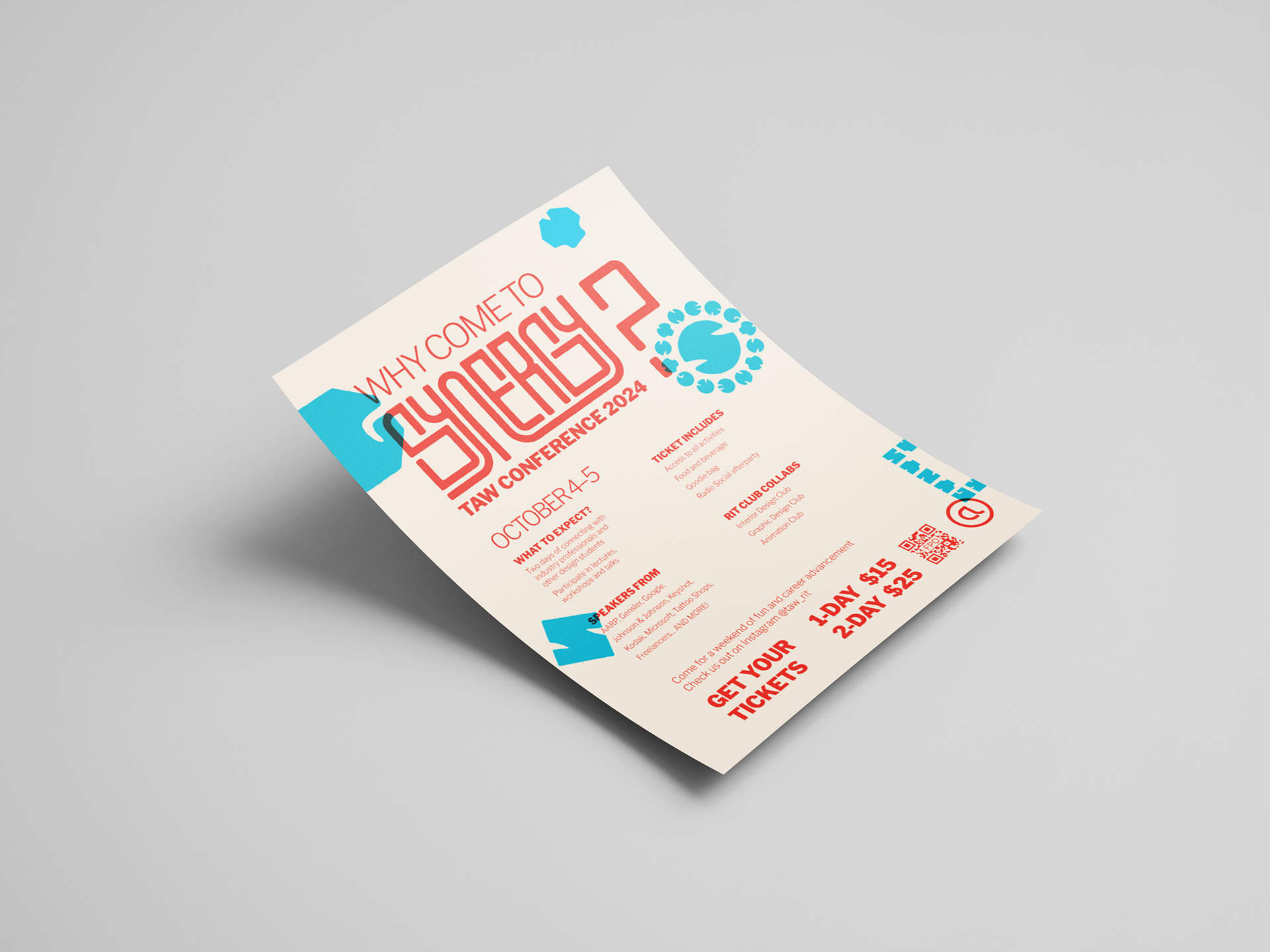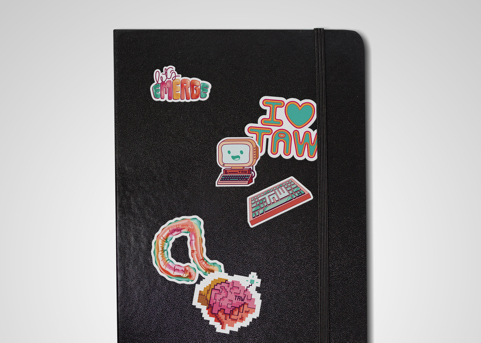
BRIEF
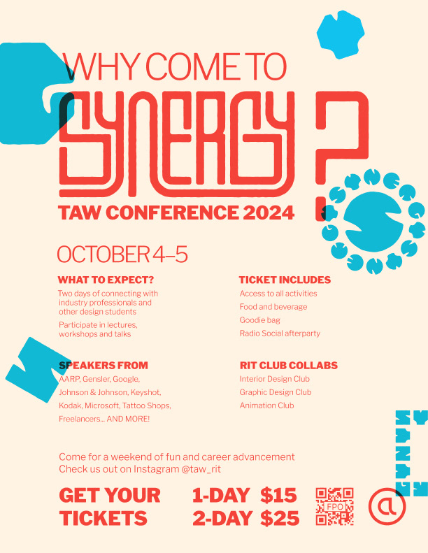
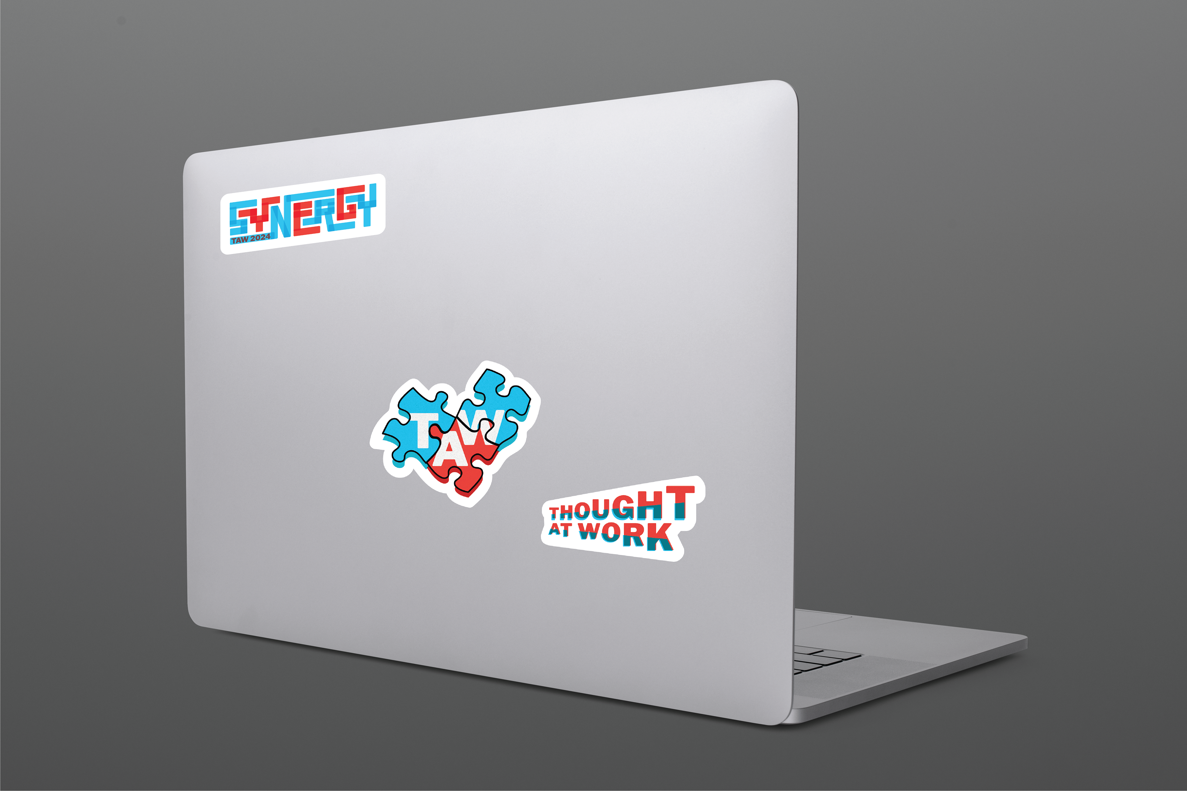
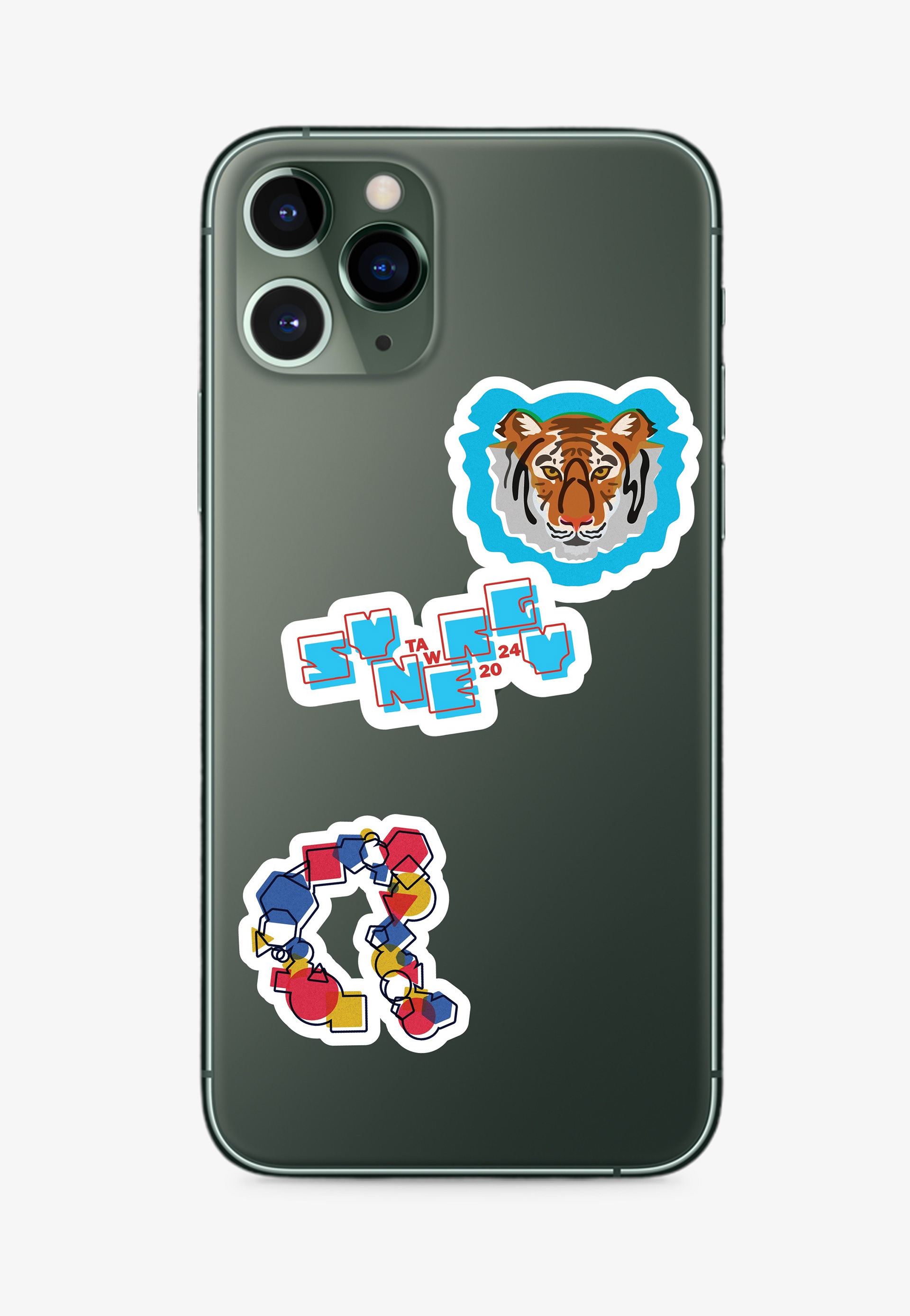
Following the stickers’ success from the first TAW conference I was a part of, I was brought in to design more assets for my second year in the team. I was tasked with creating another sticker sheet, ID badges for our conference speakers, and a promotional poster.

MY TAKE
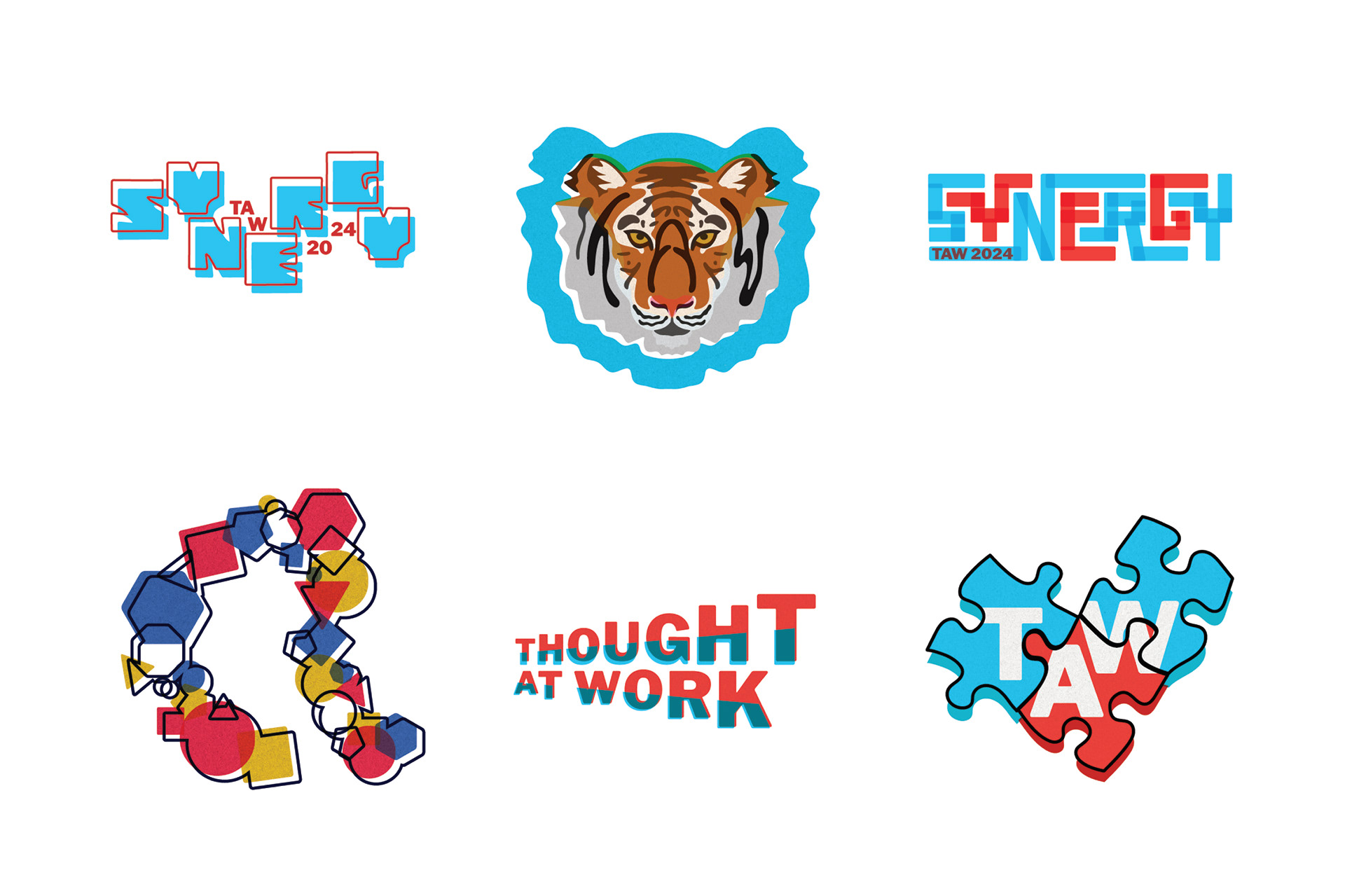
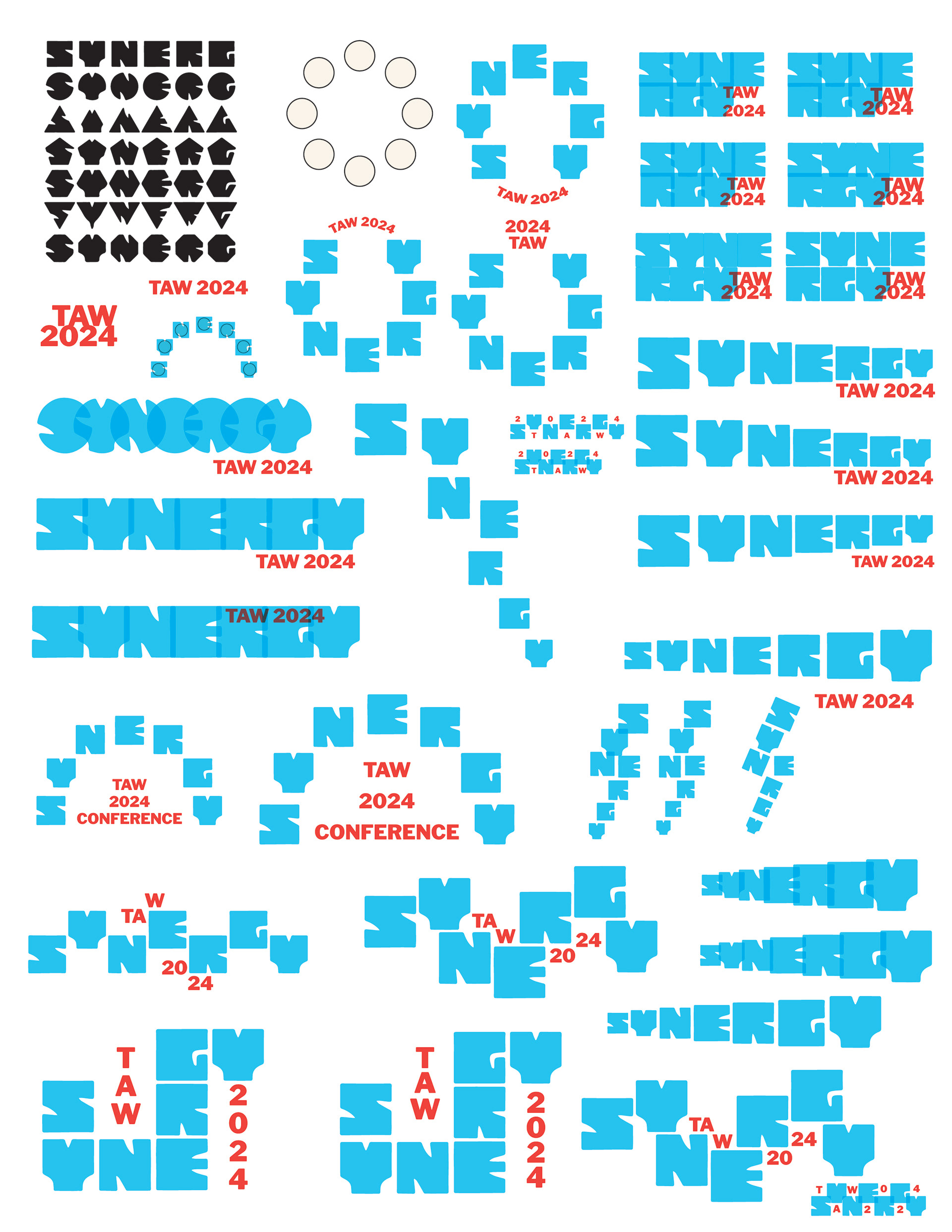
For 2024, the conference theme was “Synergy”. In the design world, and as observed in our team, greatness comes from the collaboration of many people with different skills and ideas. To turn the theme into visuals, I focused on layering and the interaction of many moving parts.
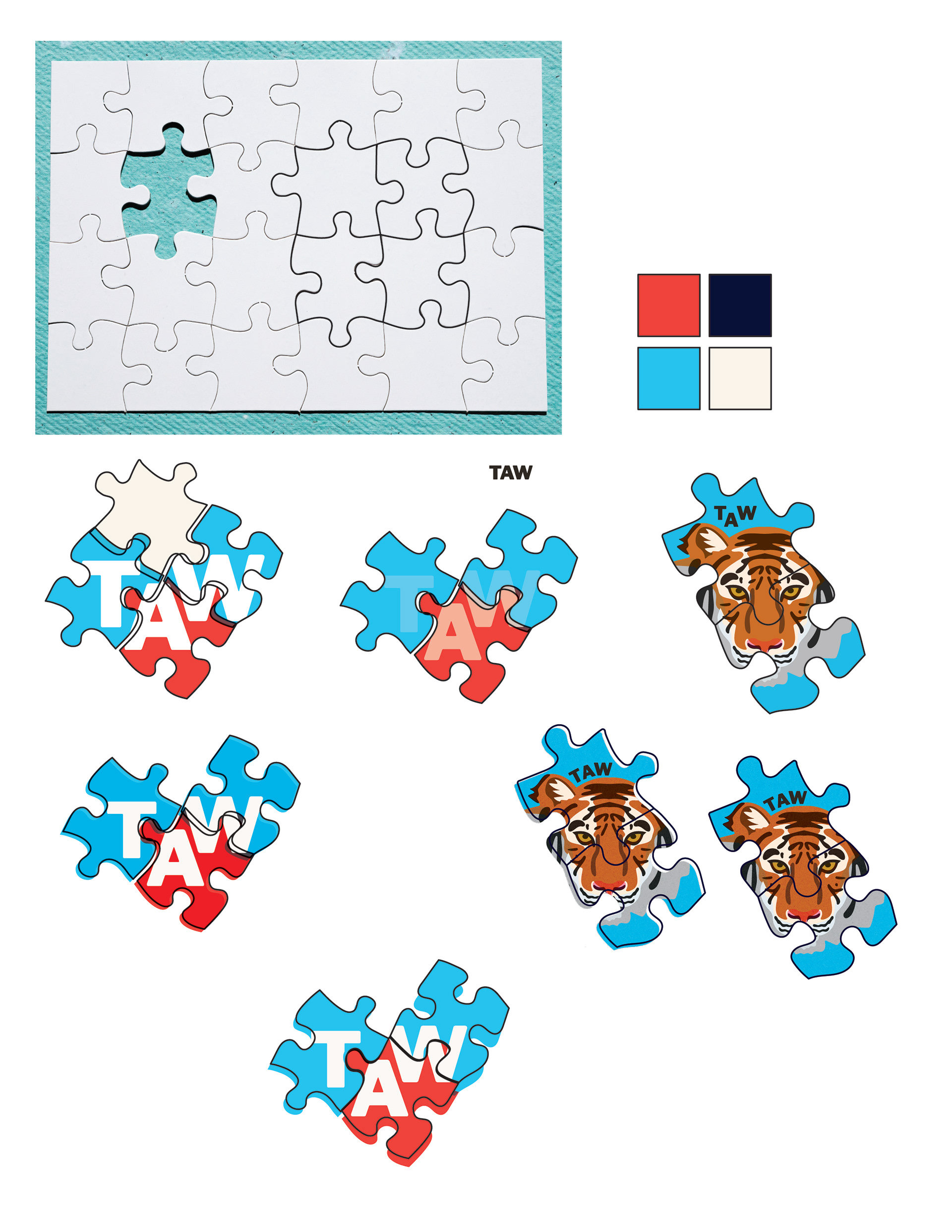
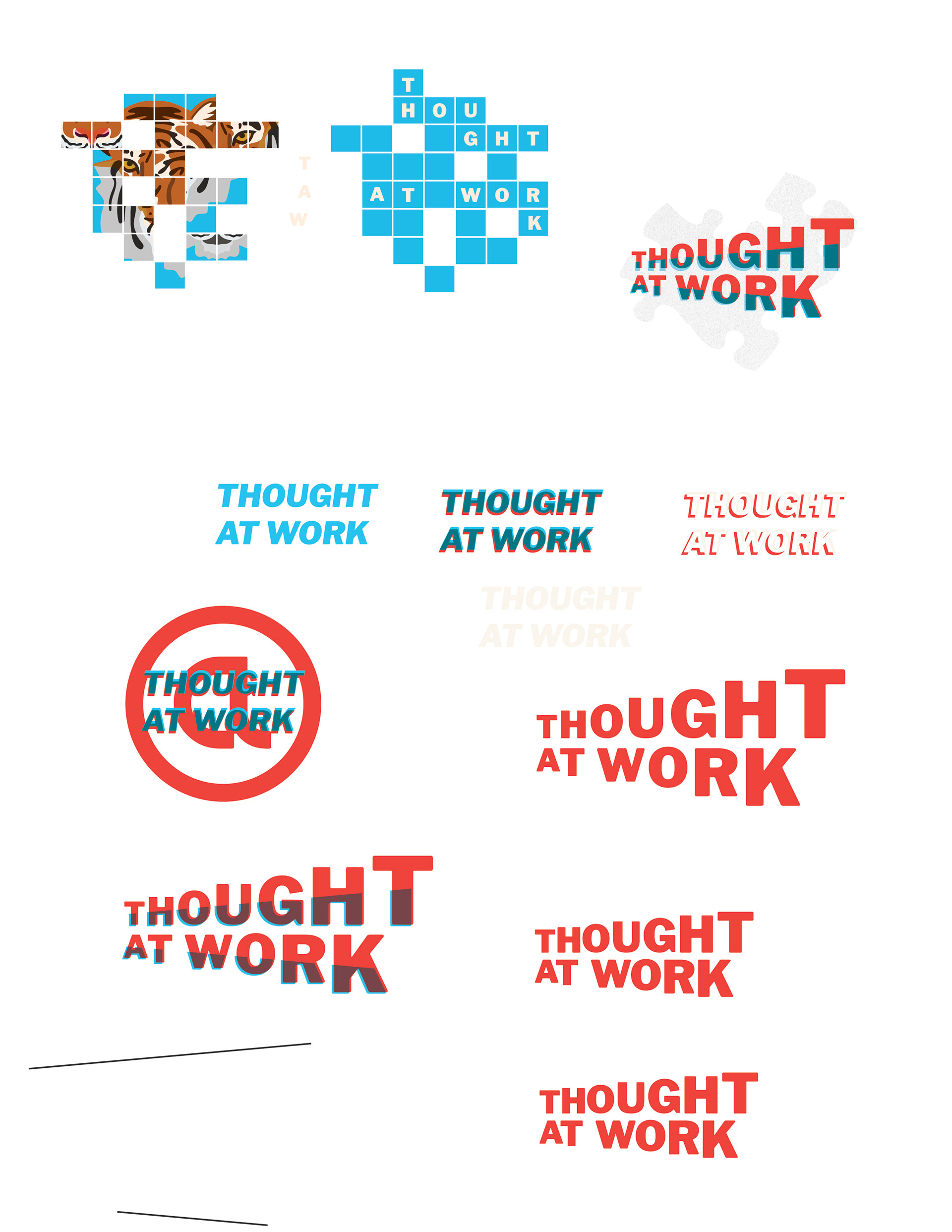
This time around, I wanted to create stickers that worked seamlessly with the conference’s branding established by TAW’s talented Creative Co-Directors, who were inspired by the aesthetic of risograph and screen printing. Different from before, I made typography the center of attention of most of the stickers. I also strove, once again, to make designs that RIT students would enjoy.
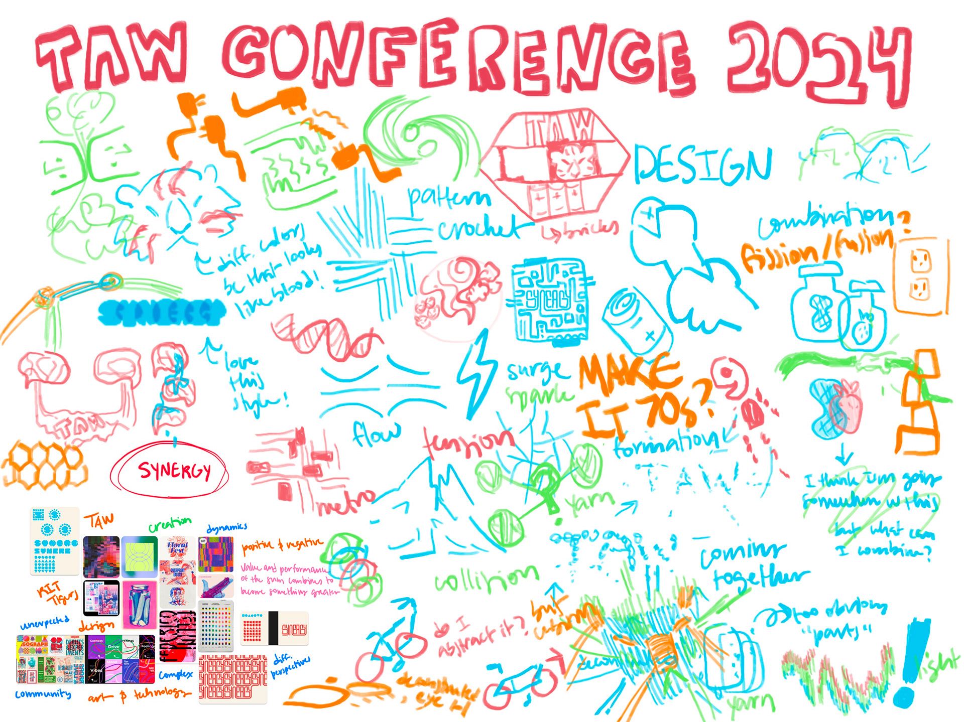
MOODBOARD
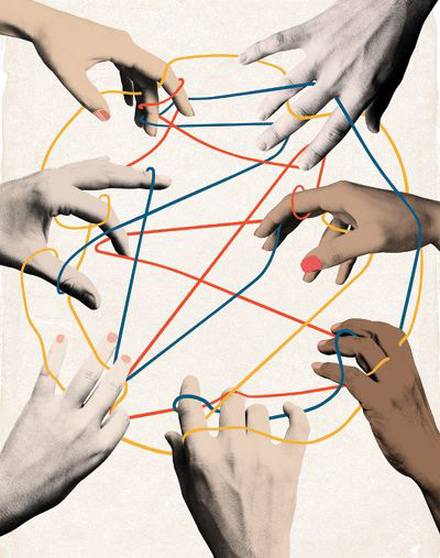


Compared to the first conference, it took longer for me to figure out what motifs would work well with the Synergy theme. It wasn’t until I remembered the phrase “the whole is greater than the sum of its parts” that I was able to give my designs a clear direction.
SKETCHES
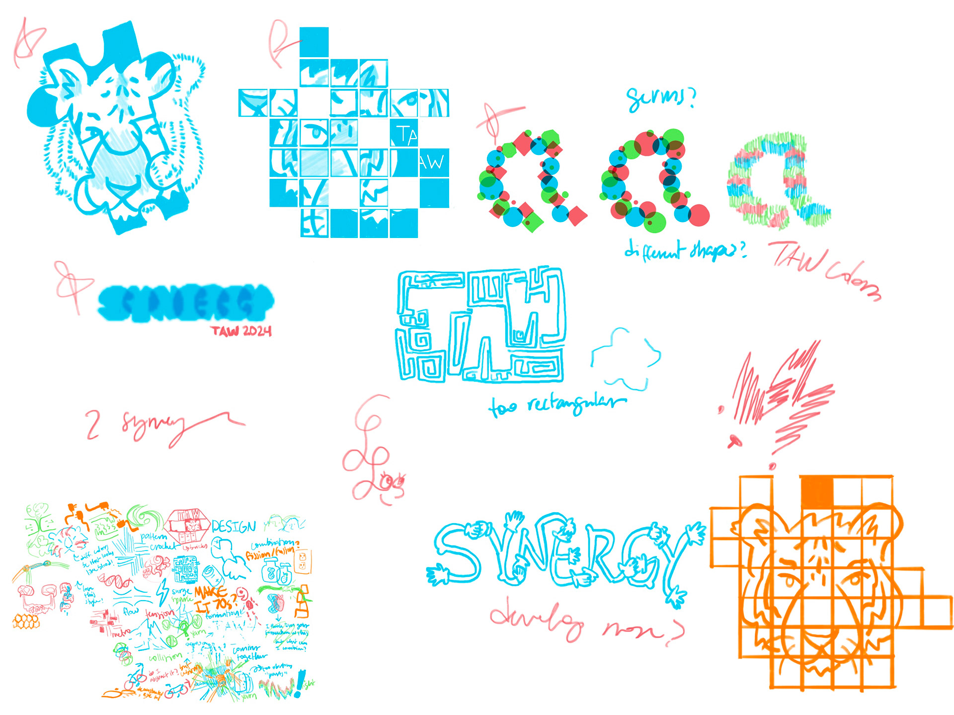

STYLISTIC CHOICES
The layering of objects and colors not only made sense for the theme, but it also aligned with the visual style of risograph and screen printing. My intention was to make vibrant and fun stickers. For the stickers, I enjoyed playing with the words and showcasing them in interesting ways. I was especially proud of the way I hid “TAW” in the tiger’s stripes, which was a suggestion from our art team. Offsetting the colors and lineart gave the stickers another point of visual interest. As for the ID badge and the poster, I wanted to put a special emphasis on the fun shapes and the logo created for our conference’s branding. For that reason, I decided to keep the designs simple and clean, yet still impactful.