BRIEF
For this branding project, the task was to create the logo for a company made from scratch.
MY TAKE
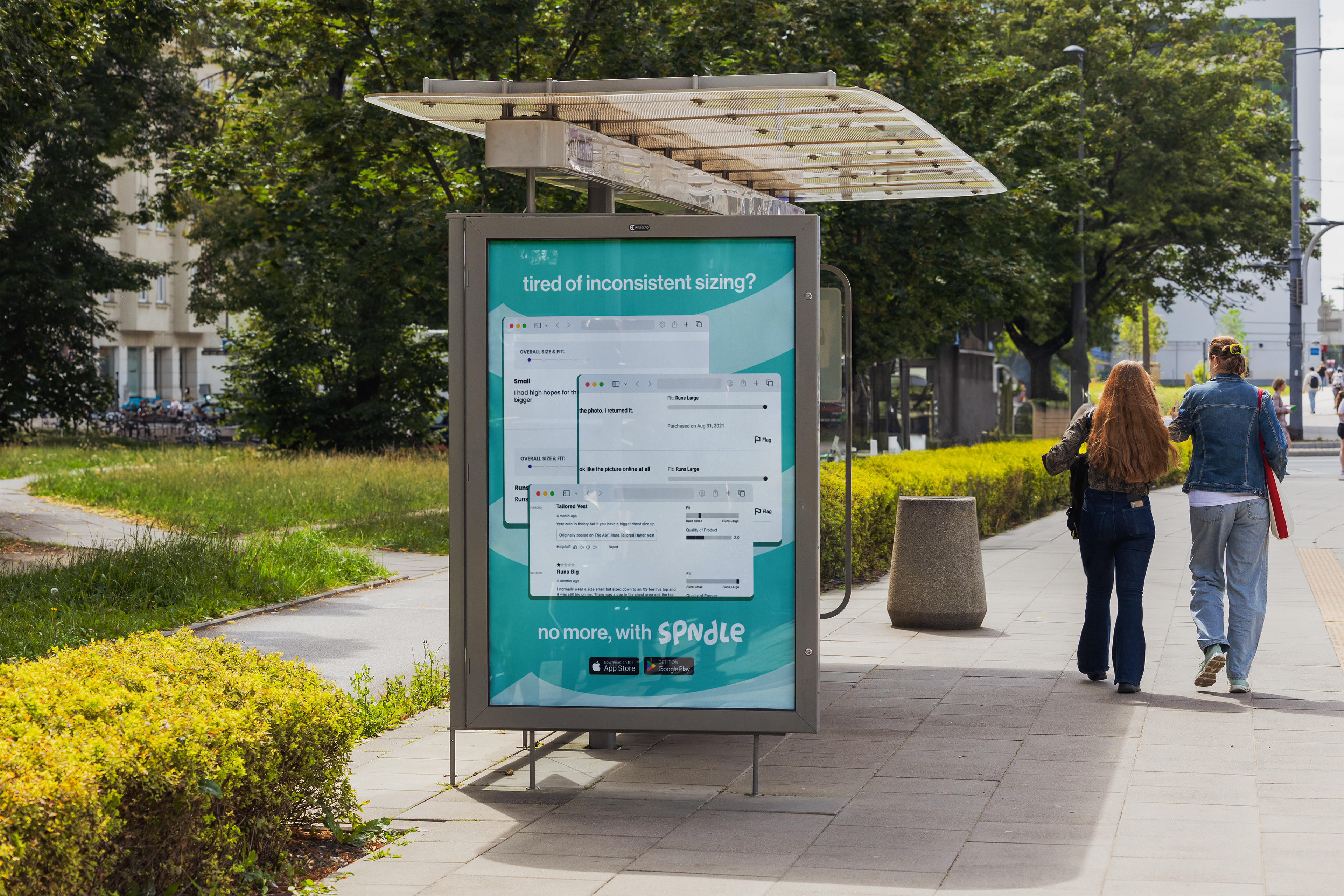
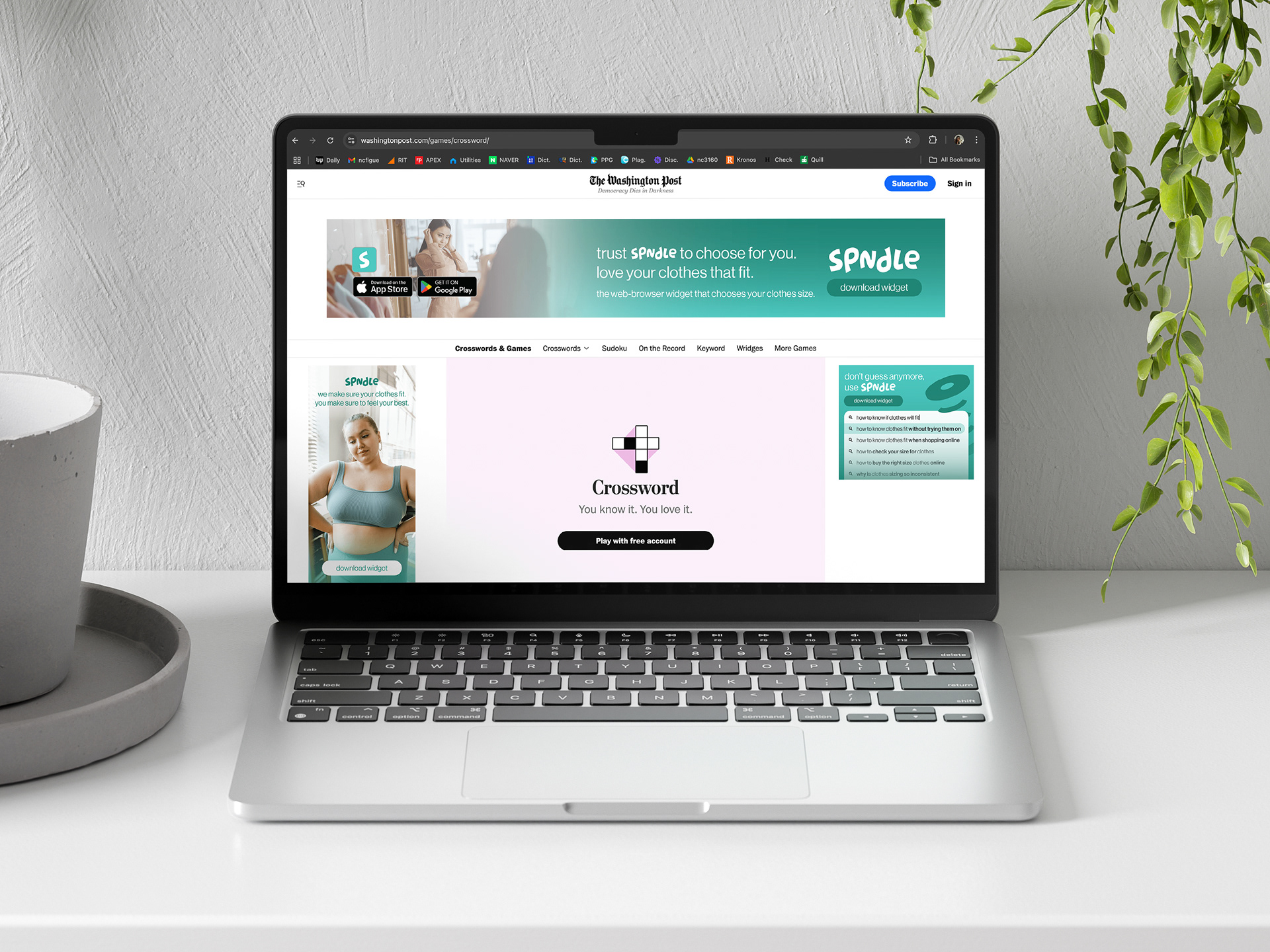
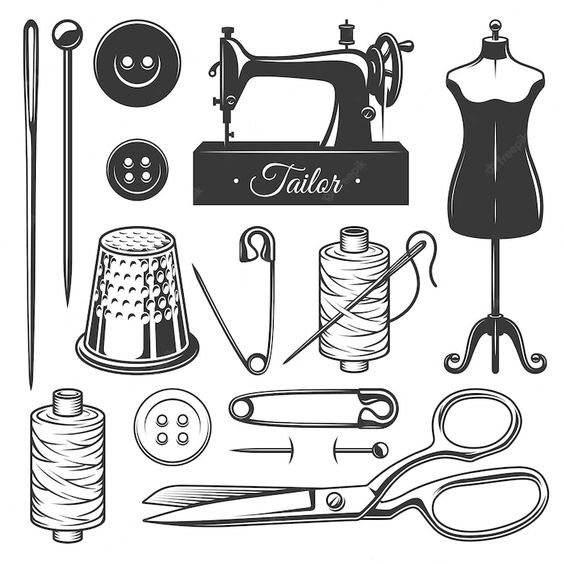
I made the company SPNDLE, a web browser widget that helps customers buy clothes that will fit them properly. Once downloaded into the browser, consumers save their measurements into the program. While in an online clothing store, SPNDLE will pop up and give them the size they should choose based on the data saved and the store’s size description of the garment. If there were no way the item would fit, the program would let the buyer know the reason and recommend similar products from the same or different websites.
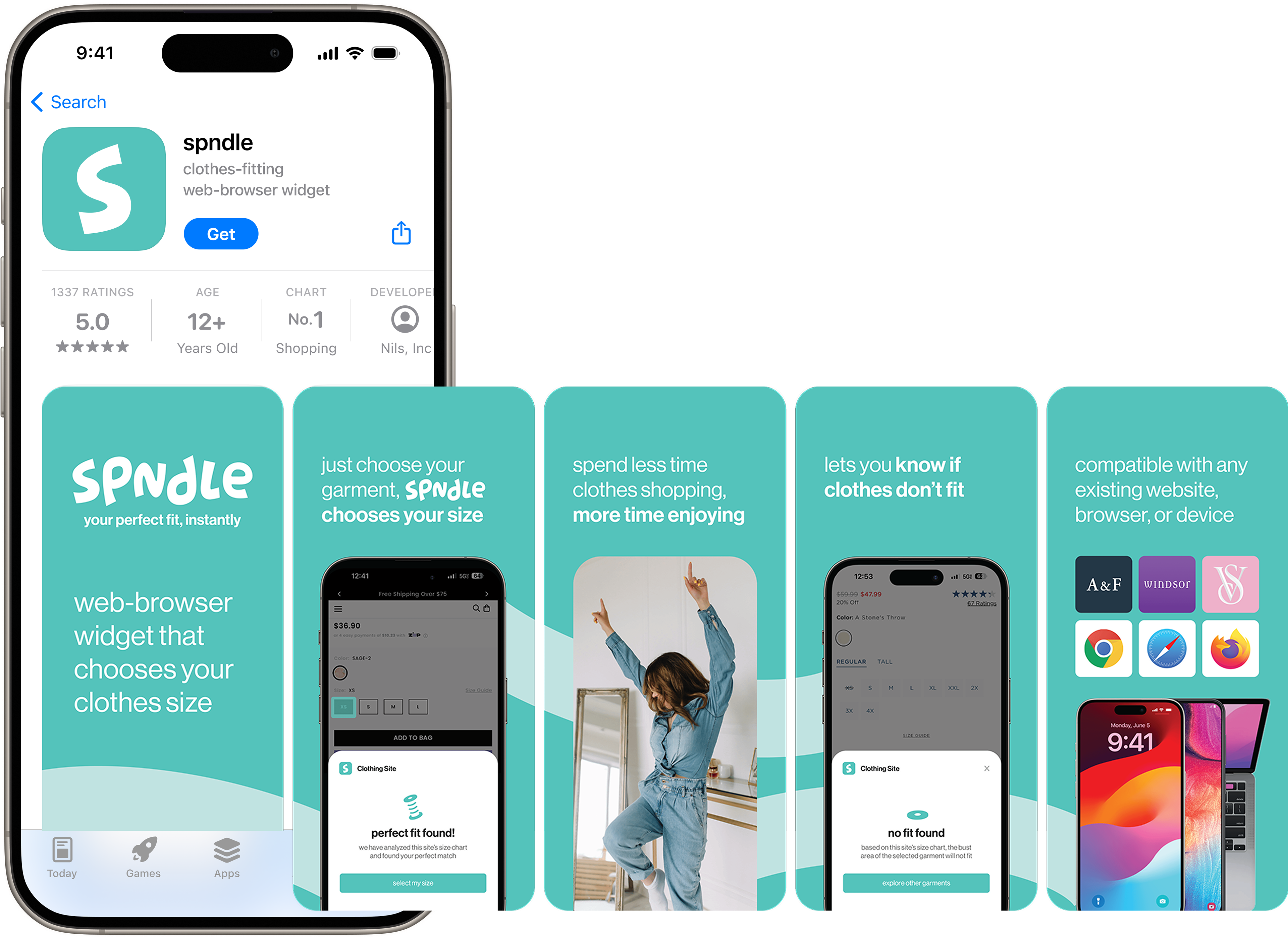
SPNDLE is for people who struggle to find clothes that fit them. They prefer to shop online since they find the in-person experience at clothing stores stressful. Demographically, the brand’s audience is mostly women between 20-30 years old who prefer to buy using a computer.
I created SPNDLE because I’m also someone who struggles to find clothes that fit me, even online. I saw an opportunity with SPNDLE because, even though most websites have measurement charts for their garments, the numbers can vary by item and company. Also, verifying if a garment will fit each time is difficult and time-consuming. SPNDLE would always be working in the background, waiting for the right moment to help find clothes that fit perfectly.
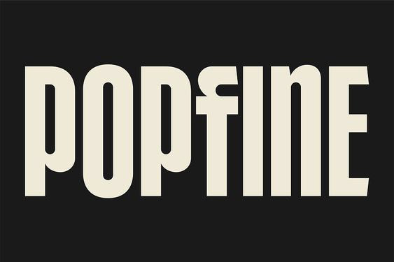
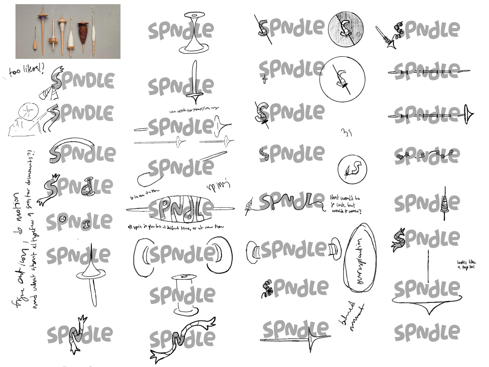
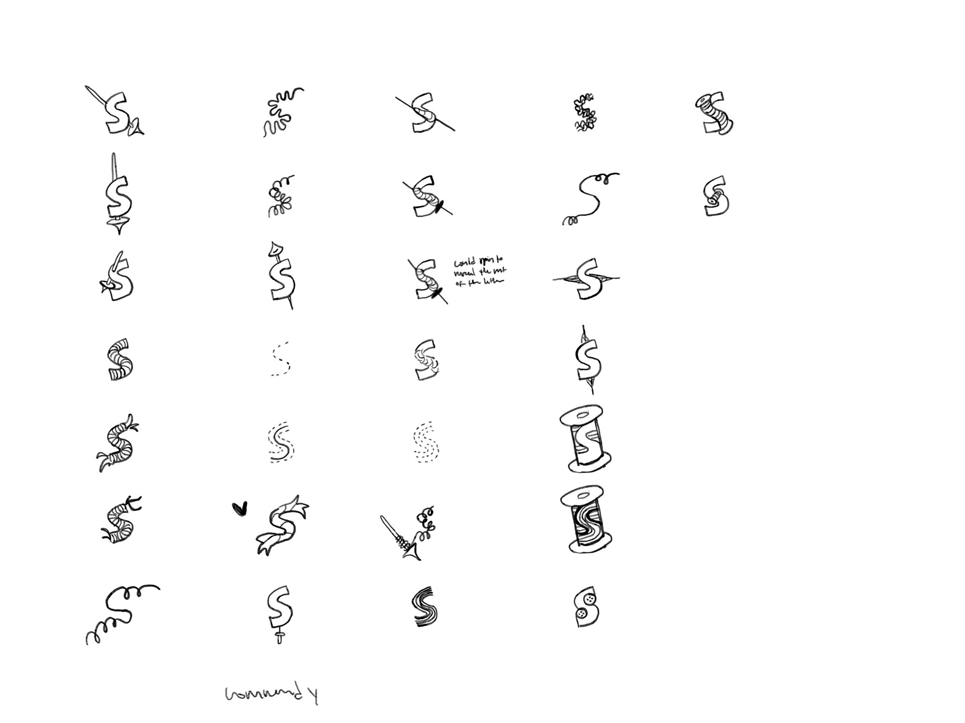
At first, I experimented with decorating letters, but I found that a simple logotype would work the best. I paired it with a primary and secondary mark. The main mark is the ‘s’ from the logotype, and the other is a spindle. I went through a series of iterations until I landed on the final logo. For the SPNDLE logo, I tweaked all the letters and created a new ‘e’.
MOODBOARD
SKETCHES
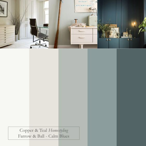
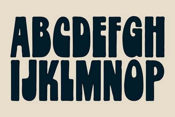
TYPE & COLOR CHOICES
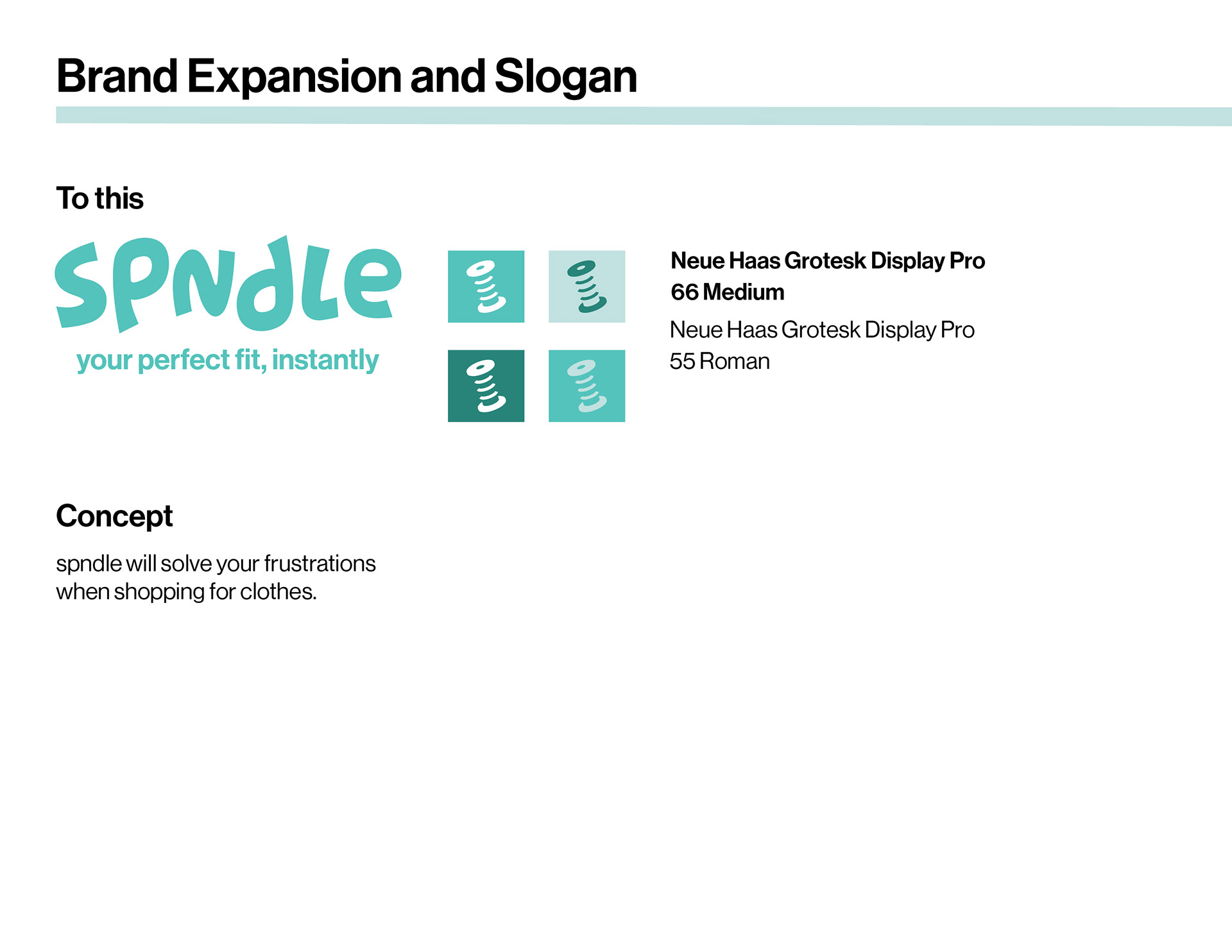
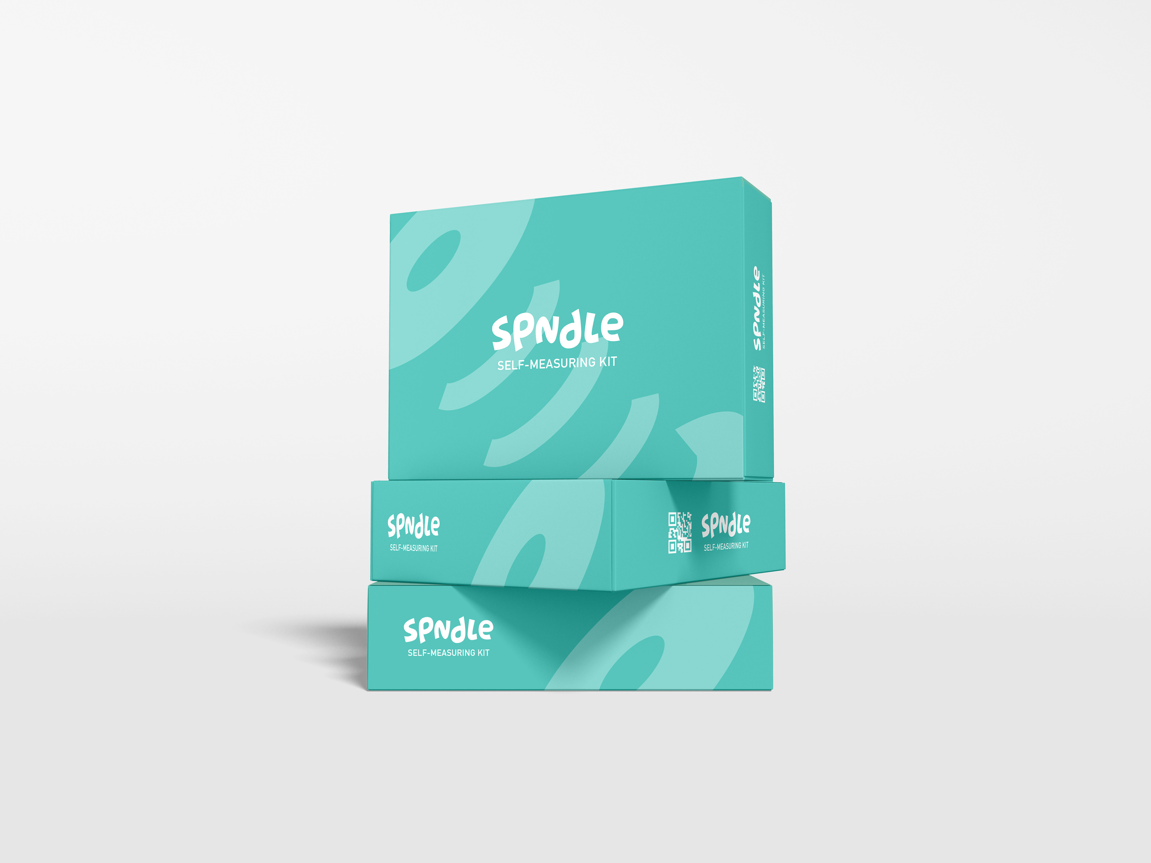
I chose a light but muted teal as the brand color because it feels vibrant yet toned down enough to be inviting. It complements the fun shapes of the logo, increasing its sense of friendliness for a stressed audience. It’s also a color between green and blue, two colors commonly used in the field of security, suggesting that SPNDLE is a trustworthy widget.
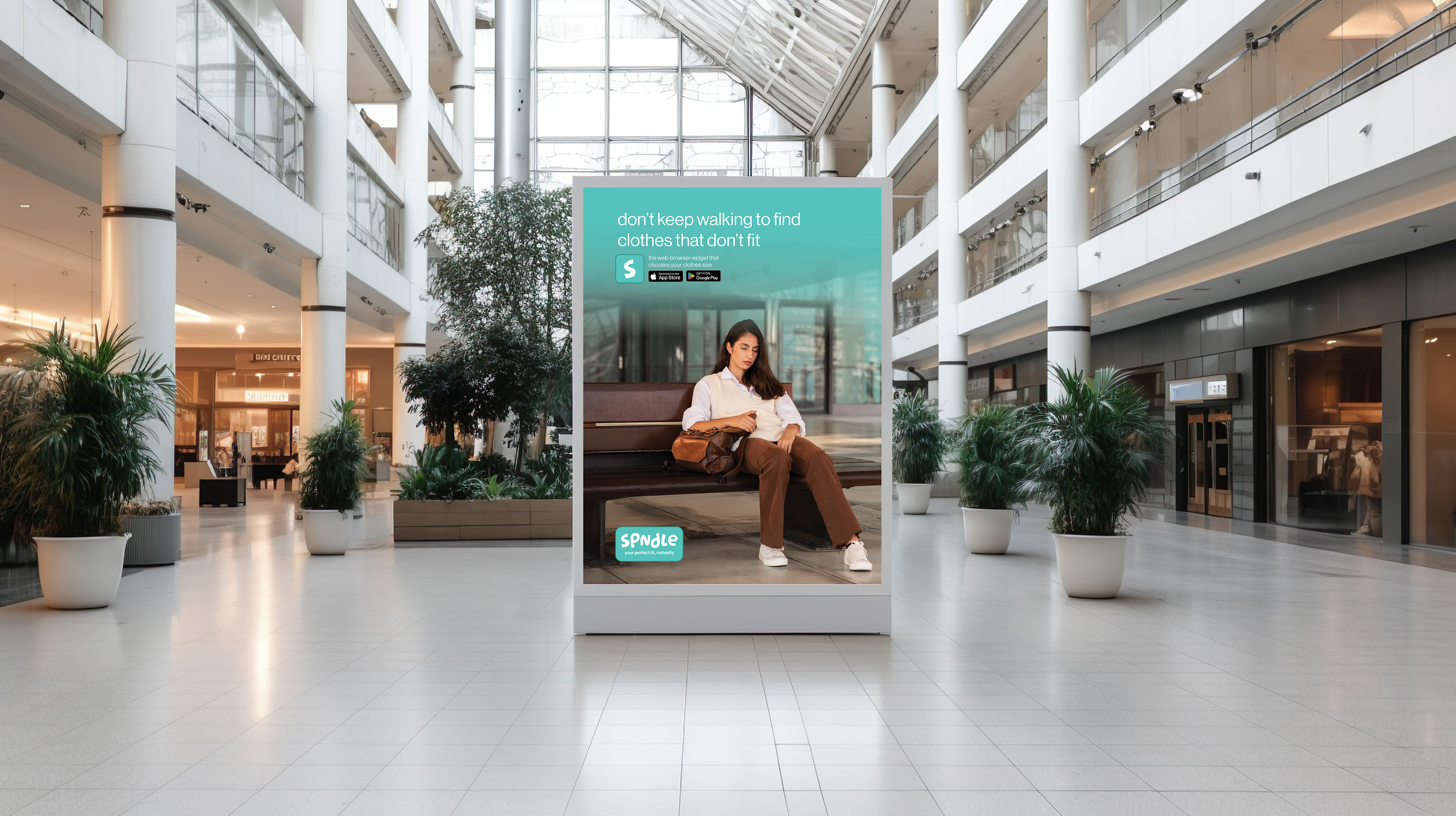
ADVERTISING CAMPAIGN
To expand upon the existing branding, I completed an advertising campaign for SPNDLE. I decided to go with a pretty extensive digital and physical campaign. The goal was to get as many eyes on the brand as possible, so spndle had to reach customers wherever they could be. That is how I created ads for social media, websites, malls, bus stops,
and the app store.
and the app store.
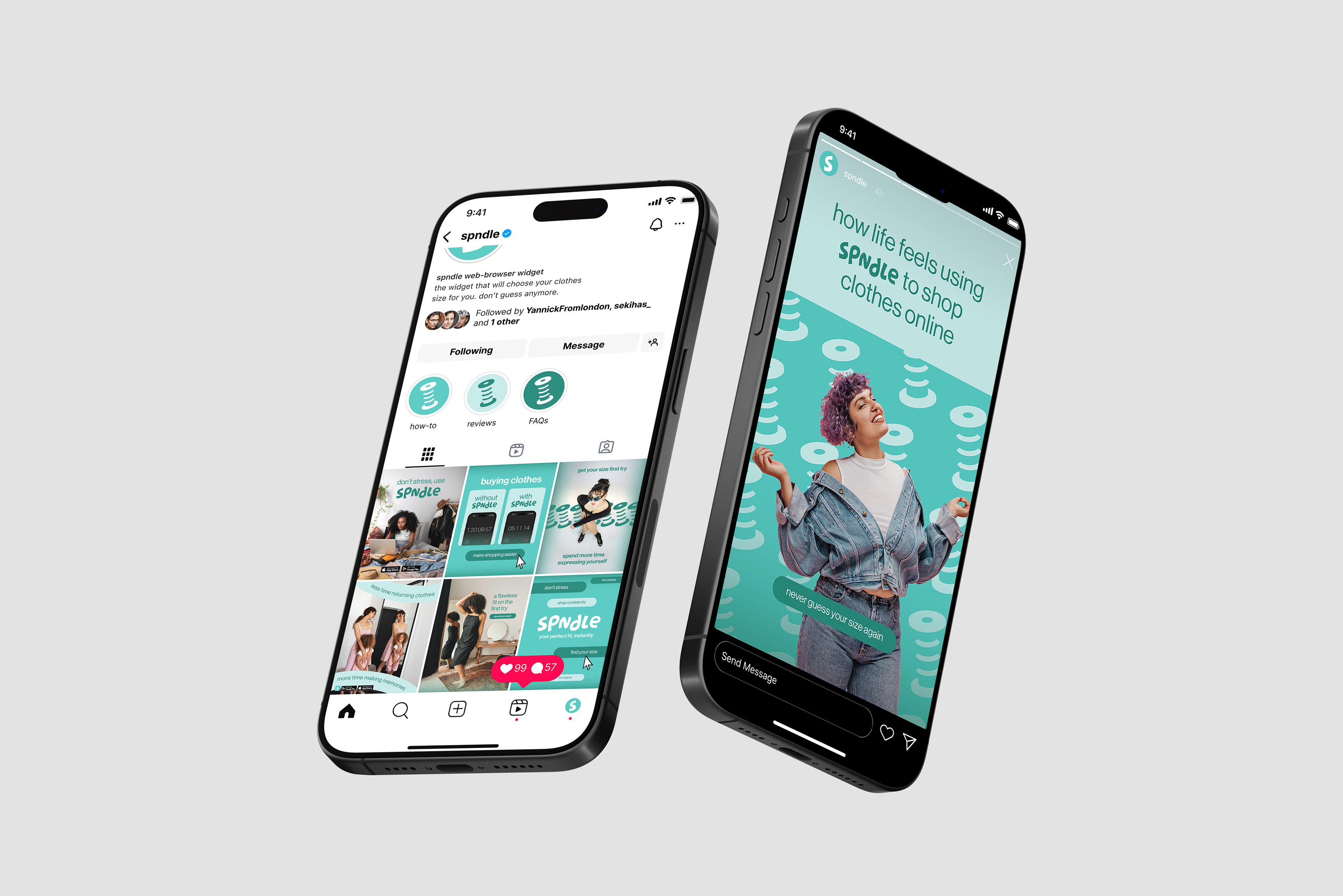
My target audience was working women 20-30 years old who are highly skilled in technology and prefer to shop clothes online because the in-person experience is stressful and they struggle to find clothes that fit them.
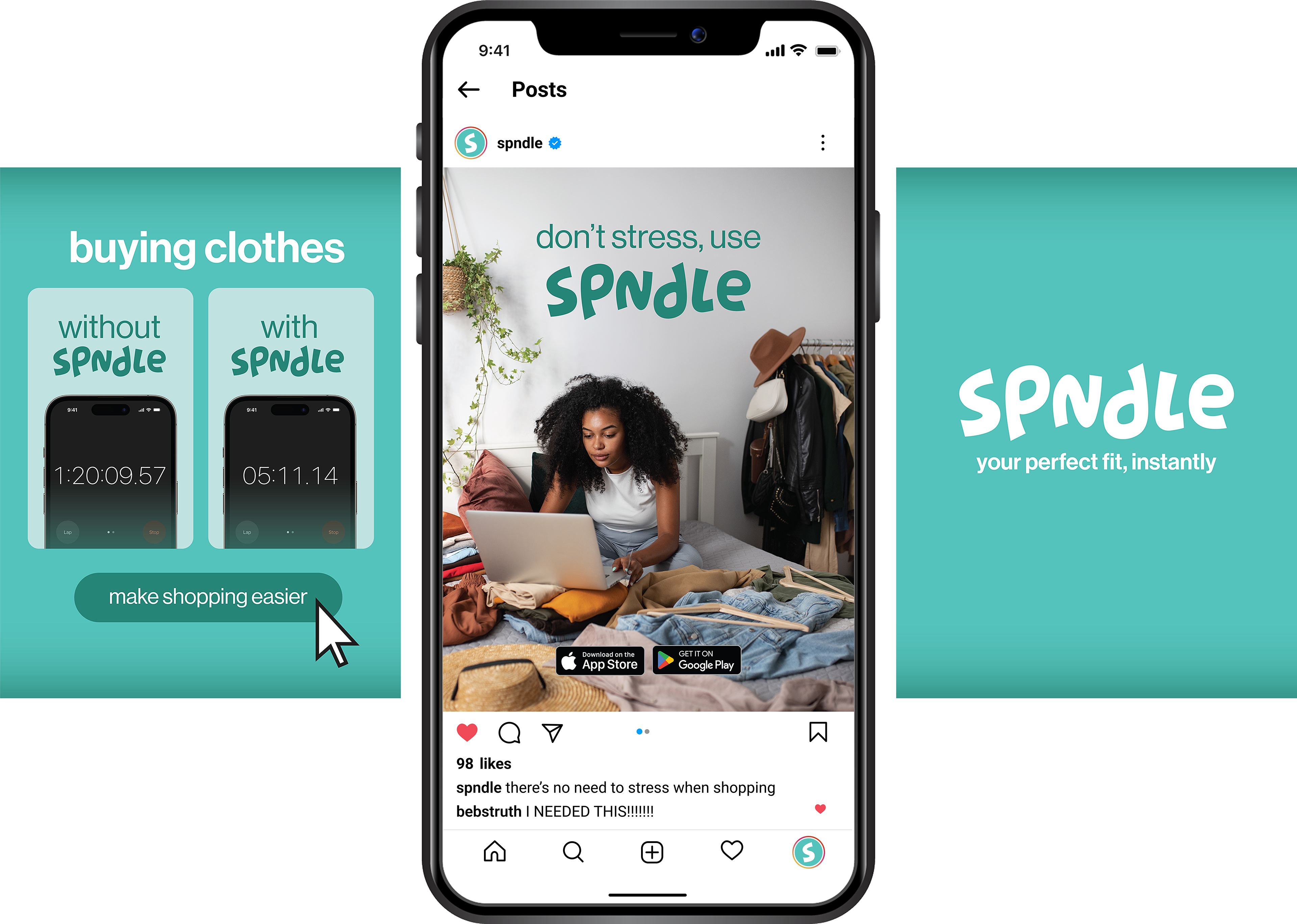
When creating ads for the widget, I focused on targeting people’s frustrations when shopping for clothes and establishing SPNDLE as the solution. Almost every single ad had a different annoyance it targeted, which resulted in the use of a couple of calls to action. As to the overall designs, I kept consistency through the use of colors, text, and the recurring SPNDLE icon. Doing that ensured that all the ads could be creative and different from each other but still look like they belonged together.