BRIEF
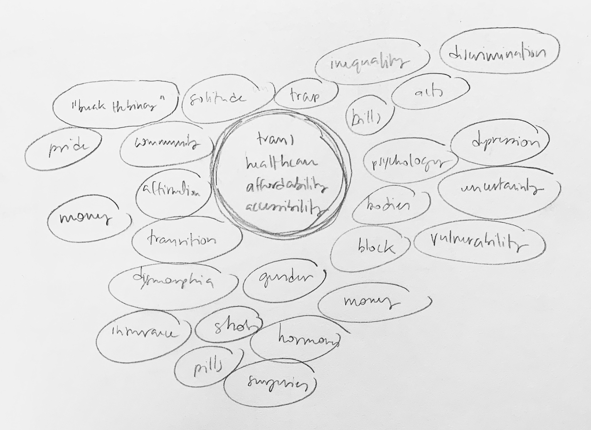
The prompt was to make two infographics about a certain topic and an animation based off of them. I created these assets to bring awareness to the unaffordability of transgender healthcare that most people are unfortunately unaware of.
MY TAKE
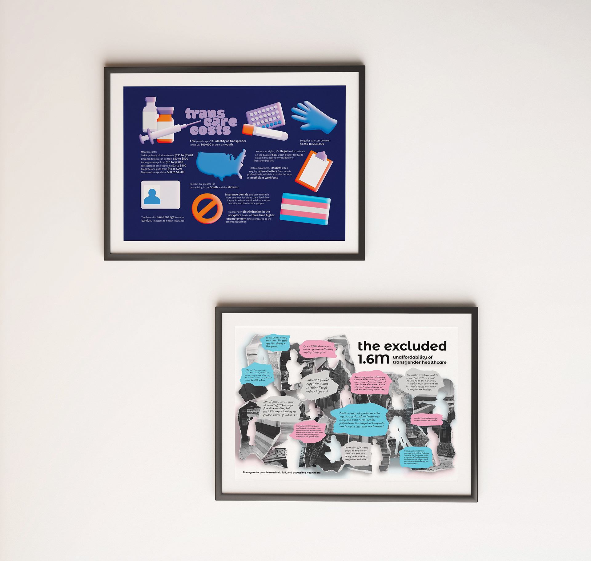
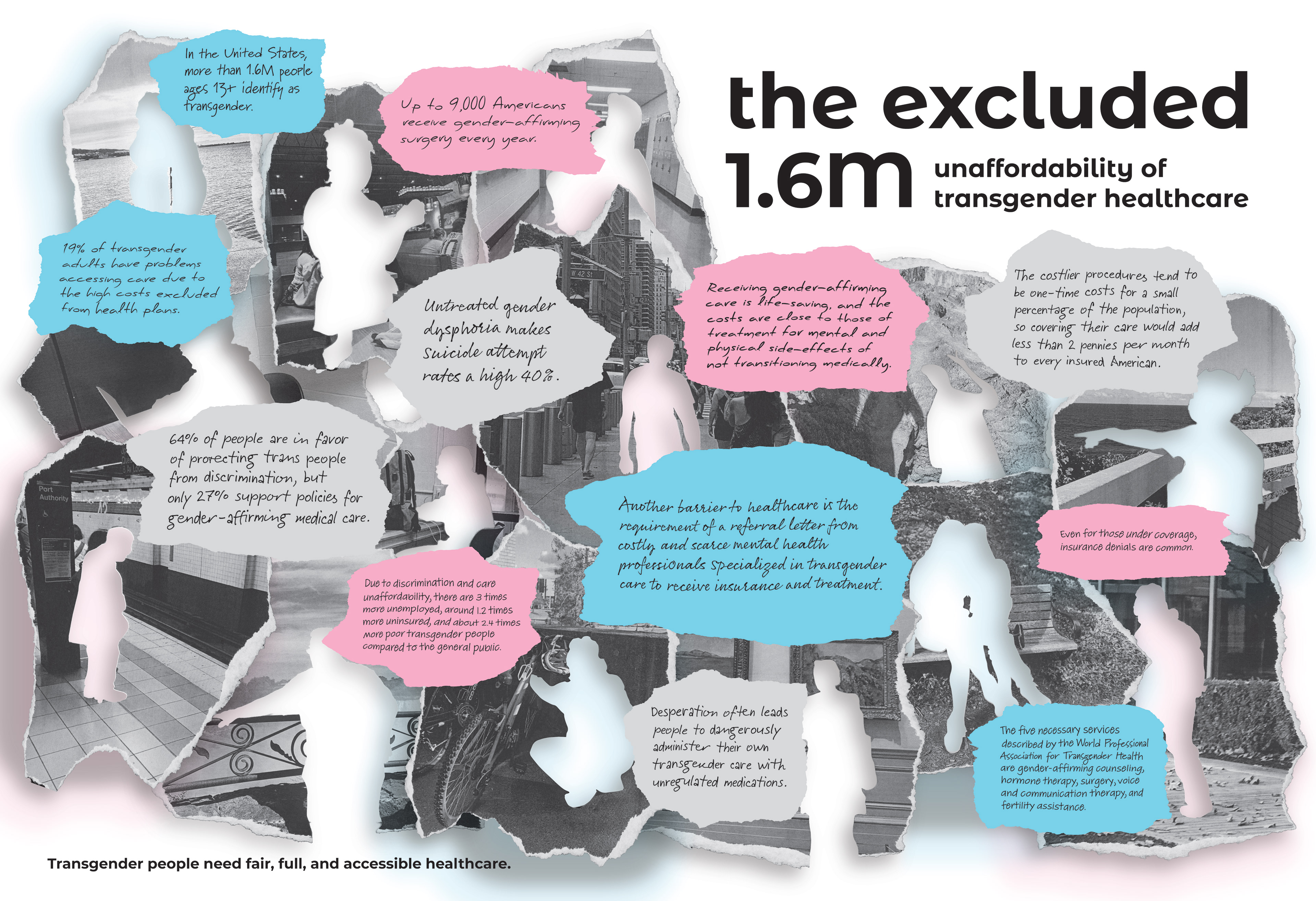
I focused on two almost entirely different audiences for each one. My first target was less informed adults who can influence the transgender healthcare environment.
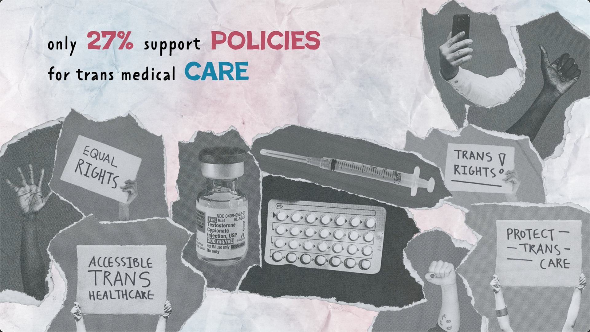
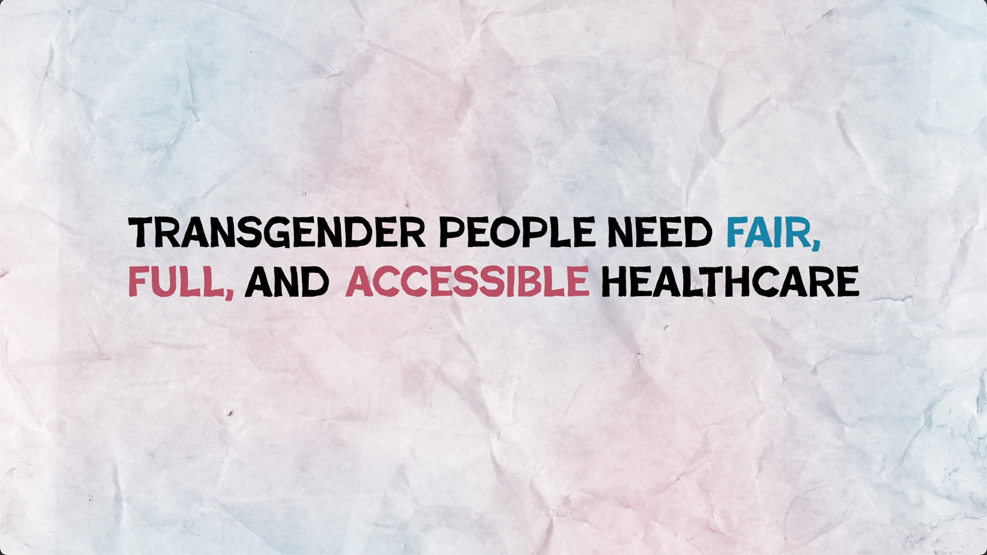
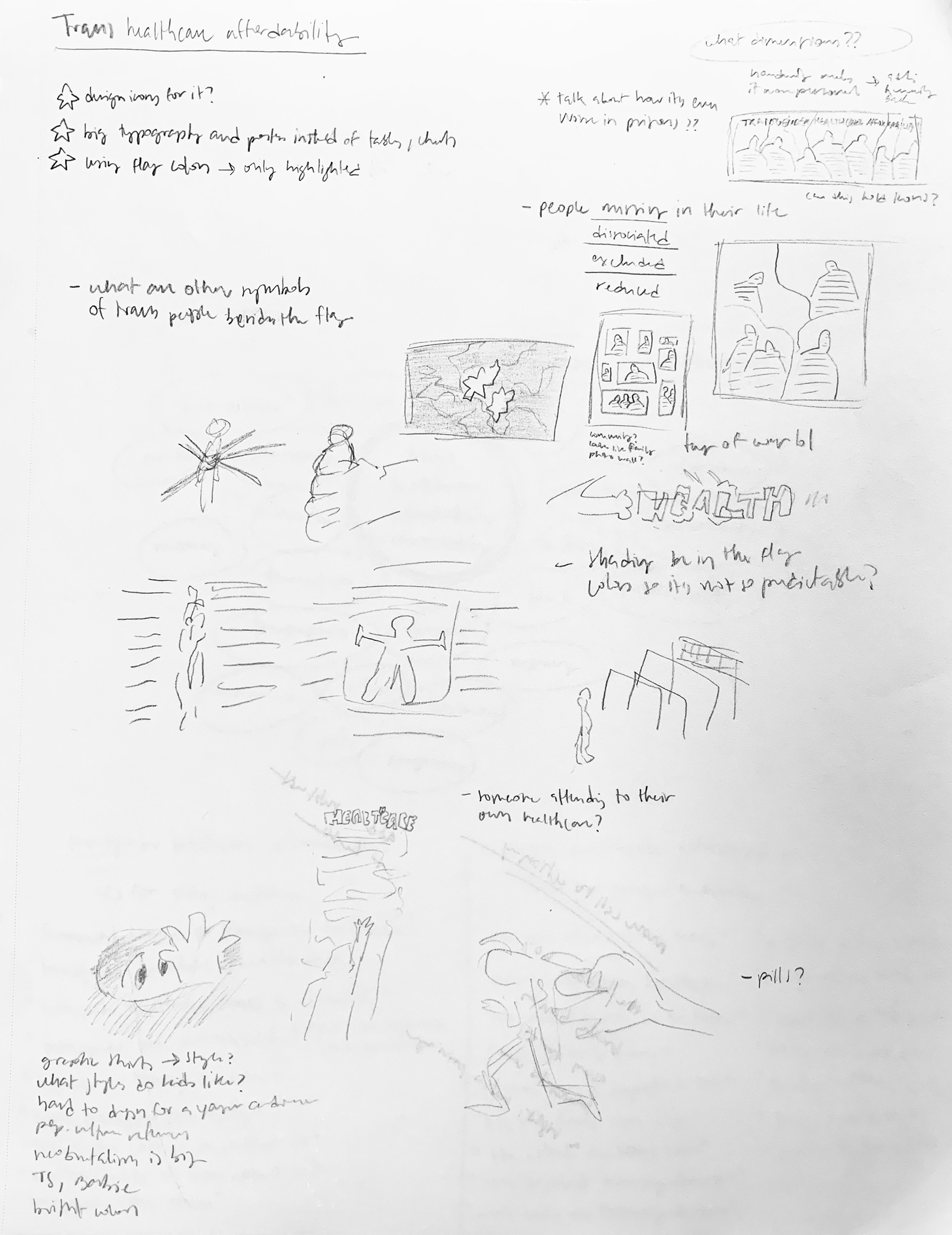
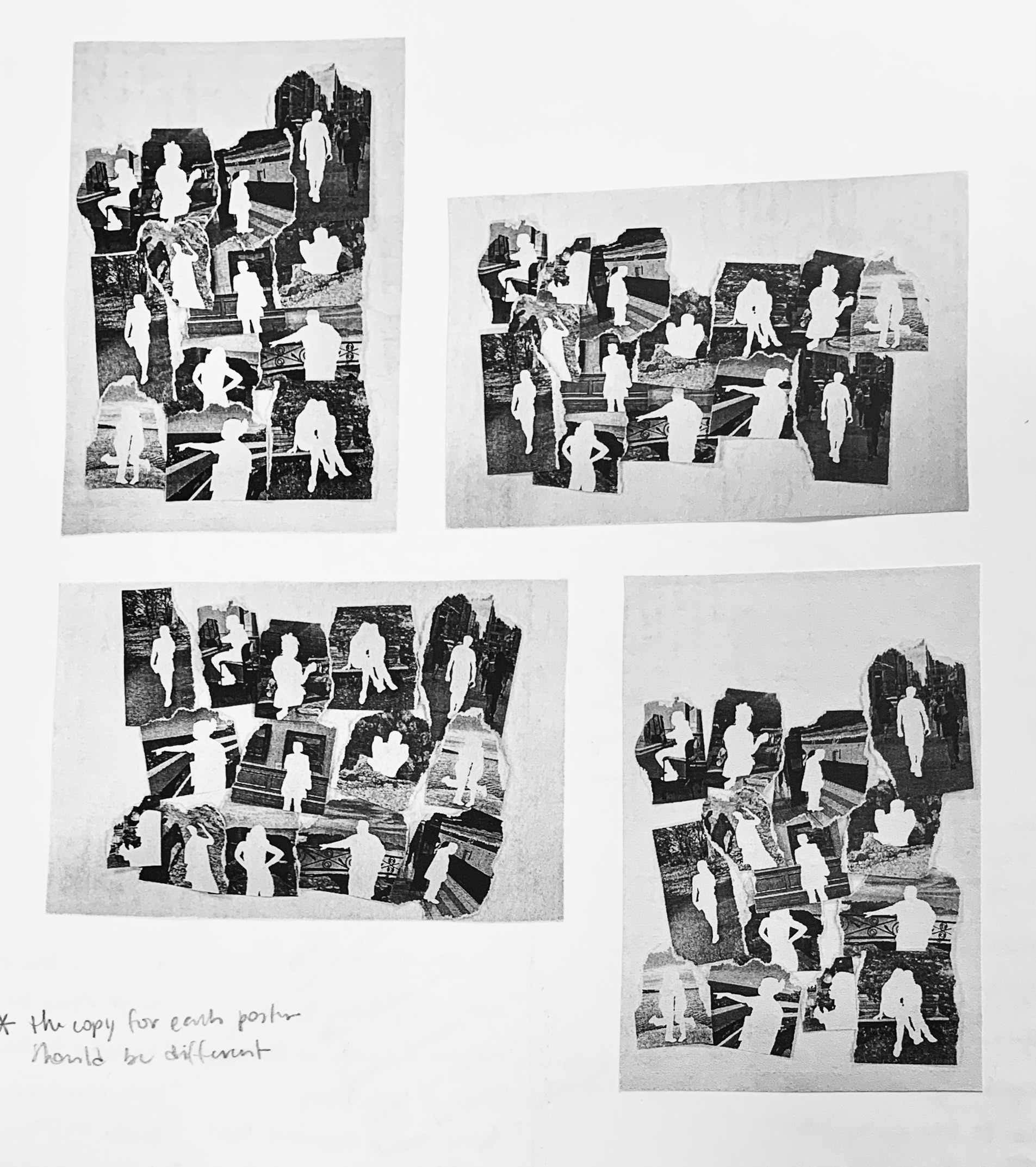
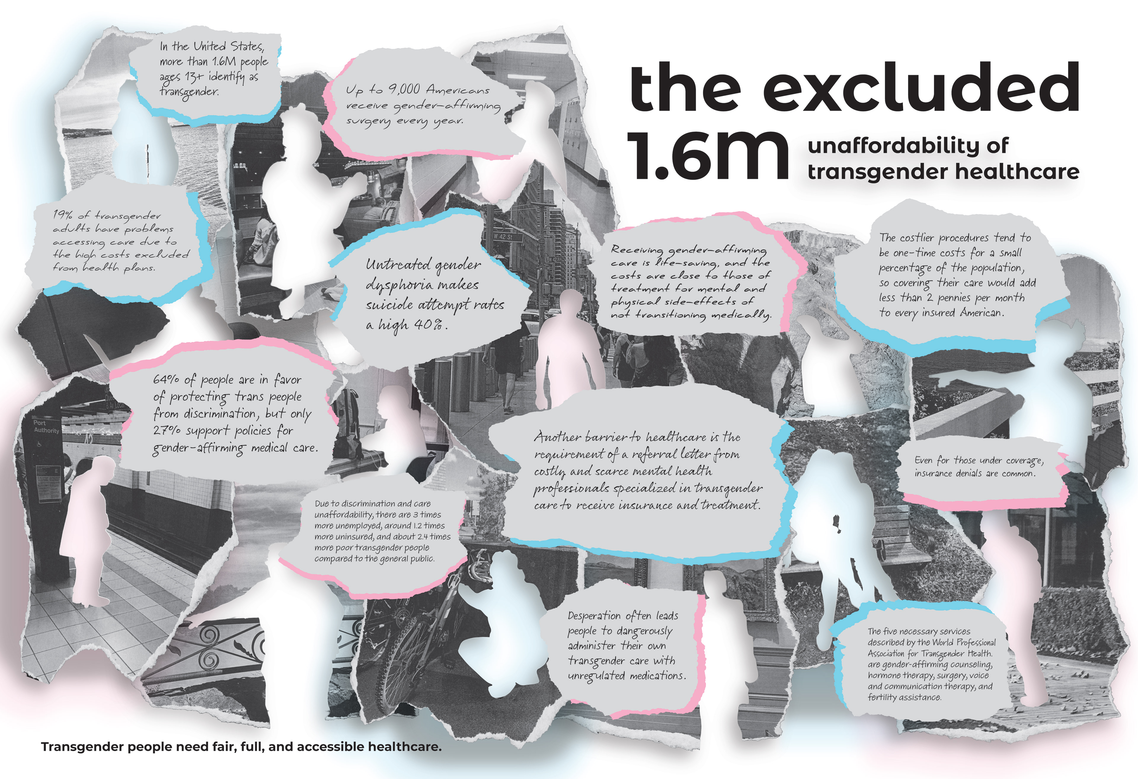
For the adult demographic poster, I focused on real people and their lives by using photographs. One of my peers, as part of the transgender community, graciously offered to participate in a photo shoot for the infographic.
The absence of people in the pictures represents the exclusion of transgender people in healthcare (not to mention other areas of their lives).
I printed out, cut out, ripped, and scanned the pictures to get the most realistic and organic look possible. Using that organic feel with the different typefaces that simulate handwriting, I aimed to add some human presence back into the infographic.
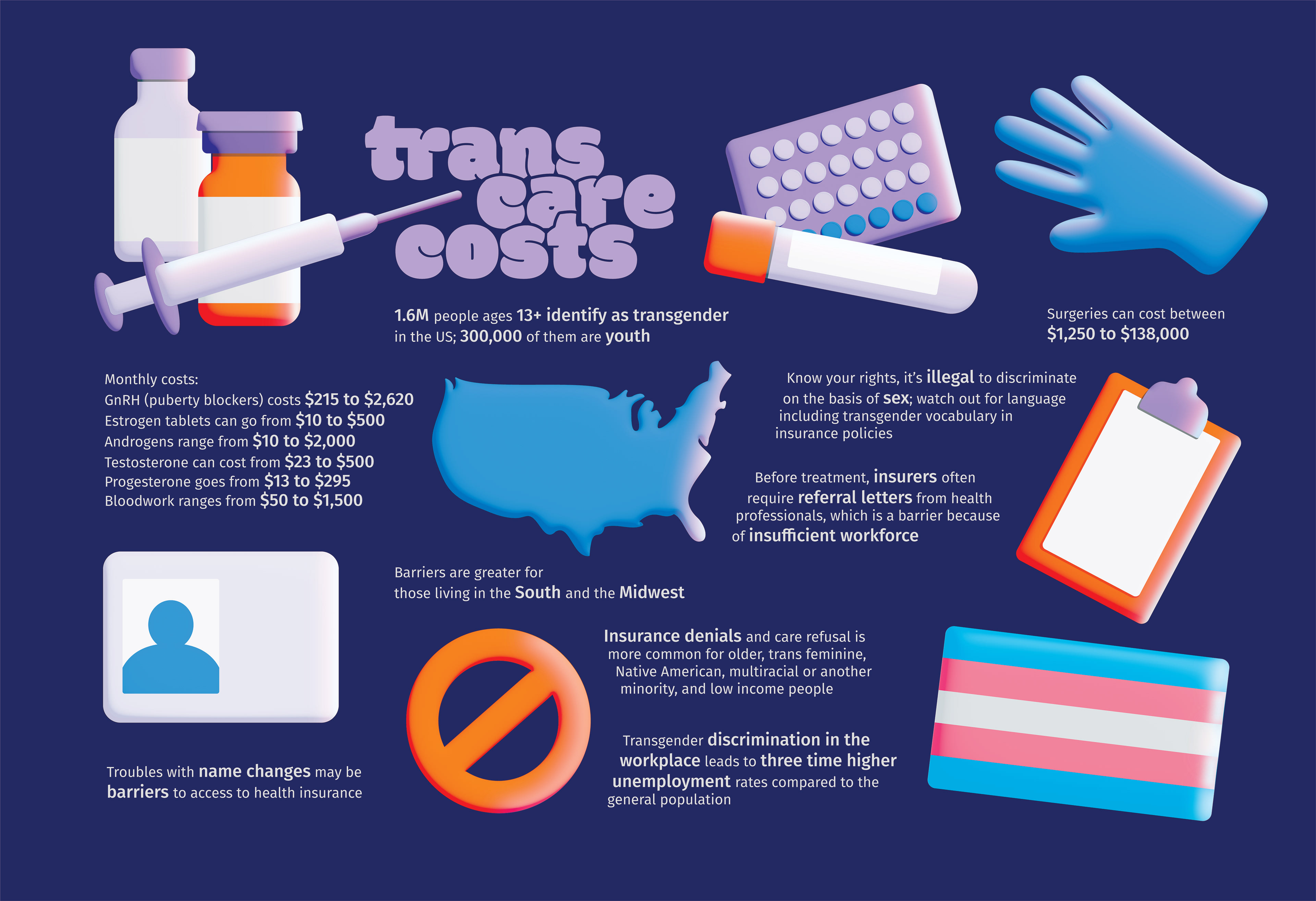
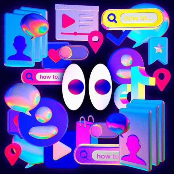
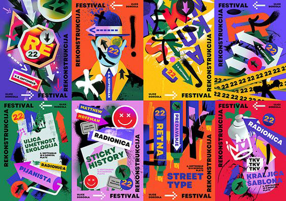
The second group I designed for was junior to high school transgender youth to make them aware of the costs that they can encounter on their transgender journey. Because the second poster focuses on the younger generation, I made fun and vibrant graphics for it.
Having eye-catching icons that relate to the information I included also allowed me to simplify the text as much as possible. Recent generations have shorter and shorter attention spans, so I made the poster more digestible that way. I know financial factors can be a tough topic to talk about, so I wanted the infographic to feel approachable instead of intimidating.
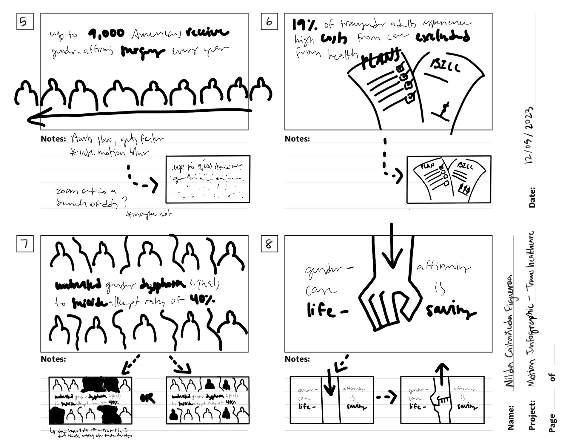
To create the motion infographic, I already had a stylistic reference from the collage poster so I only had to take on the animation process.
MOODBOARD

SKETCHES
VERSIONS
My original goal was to be subtle with the use of the transgender flag color palette on both posters, but, as you can see, I ended up not doing that for the collage poster. I thought it looked too gray and unappealing, so I added more color. (I tried different ways to do this.)
The second poster has the colors hidden in the highlights. I preferred a color palette that allowed me to play more with contrast.

For the youth infographic, the most difficult part of the process was figuring out the layout. After having a strong vision of what I originally wanted, which was having the text and objects surrounding a centered title, I realized it wasn’t working.
I was at a standstill trying to figure out how to organize things but, thanks to helpful feedback from my peers and continuous rearranging, I came up with a solution.
REFLECTION
If I had more time, I would’ve made an actual transgender model call for a photo shoot and have proper diverse representation in all my pictures, not in only a few.
If I were to return to the icon poster, I want to experiment more with the lighting.